Chapter 17 Visualization with ggplot2 - Animation
Animation is a great visual way to tell a story with data. There is a time dimension in your data, i.e., the data is observed at multiple time point, you can consider to do an animation to show how your data evolve over time.
First, we need to install the gganimate package for making annimation
## Warning: package 'gganimate' was built under R version 4.0.5## Warning: package 'gifski' was built under R version 4.0.5We will study how to build animation with ggplot2 and gganimate packages. We will use the gapminder dataset for illustration.
Read the gapminder.csv into R and examine the first few rows of the data using head().
##        country continent year lifeExp      pop gdpPercap
## 1: Afghanistan      Asia 1952  28.801  8425333  779.4453
## 2: Afghanistan      Asia 1957  30.332  9240934  820.8530
## 3: Afghanistan      Asia 1962  31.997 10267083  853.1007
## 4: Afghanistan      Asia 1967  34.020 11537966  836.1971
## 5: Afghanistan      Asia 1972  36.088 13079460  739.9811
## 6: Afghanistan      Asia 1977  38.438 14880372  786.1134
The data shows the gdpDerap,lifeExpectation, population of different countries from 1952 to 2007.
17.1 Animation of scatter plot to show how two variables evolve over time simultaneously
Make a scatter between lifeExp and gdpDerap for all the years. Use the population to denote the size of the point.
p <- ggplot(gapminder, aes(gdpPercap, lifeExp, size = pop, colour = country)) +
  geom_point(show.legend = FALSE, alpha = 0.7) +
  scale_x_continuous(trans = "log10") +
  labs(x = "GDP per capita", y = "Life expectancy")
p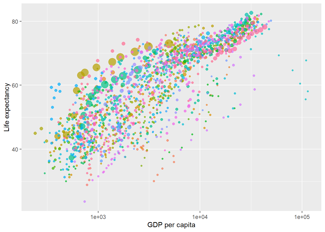
Create the gif to show each year a time:
g<-p + transition_time(year) +
  labs(title = "Year: {frame_time}")

# output GIF
animate(g, renderer = gifski_renderer())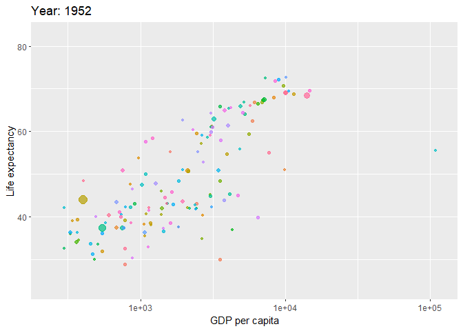
Facets by continent:
p <- ggplot(gapminder, aes(gdpPercap, lifeExp, size = pop, colour = country)) +
  geom_point(show.legend = FALSE, alpha = 0.7) +
  scale_x_continuous(trans = "log10") +
  labs(x = "GDP per capita", y = "Life expectancy")

g<-p + facet_wrap(~continent) +
  transition_time(year) +
  labs(title = "Year: {frame_time}")

# render into gif
animate(g, renderer = gifski_renderer())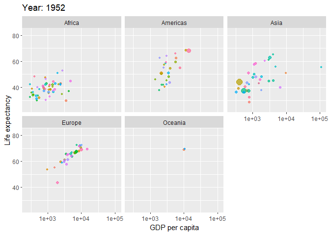
Add text to the plot
text_dat=gapminder[country%in%c("United States", "China","United Kingdom","Japan")]

p=ggplot(gapminder) +
  geom_point(aes(gdpPercap, lifeExp, size = pop, color = country), show.legend = FALSE, alpha = 0.7) +
  geom_text(data=text_dat, aes(gdpPercap, lifeExp, label=country), size=4, show.legend = FALSE) +
  scale_x_continuous(trans = "log10") +
  labs(x = "GDP per capita", y = "Life expectancy")
p 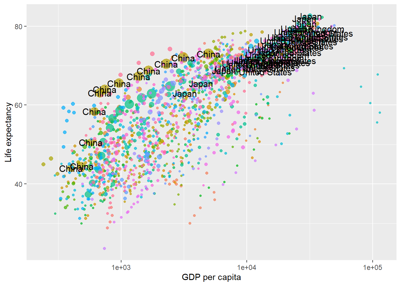
g<-p + transition_time(year) +
  labs(title = "Year: {frame_time}")

# render into gif
h<-animate(g, renderer = gifski_renderer())
h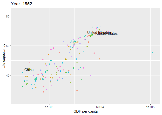
The animations shows a few observations:
Overall all, gdpPercap and lifeExp increase across the world over time.
It is clear that in Africa, a group of country is ahead of others.
Europe countries are similar.
US and UK have always among the top country in terms of GDP and lifeExp
Japan is the most health country
China has a large population and grows very fast in lifeExp and GDP.
17.2 Use a line chart to show how gdpPercap evolve over time
Here we create line chart to show how gdpPercap evolve over time. We will then add animation to the chart to gradually show the line evolve over time.
ggplot(gapminder, aes(year, gdpPercap, color = country)) +
  geom_line(show.legend = FALSE, alpha = 0.7) +
  labs(x = "Year", y = "GDP per capita", color="country")+
  theme_minimal() +
facet_wrap(~continent) 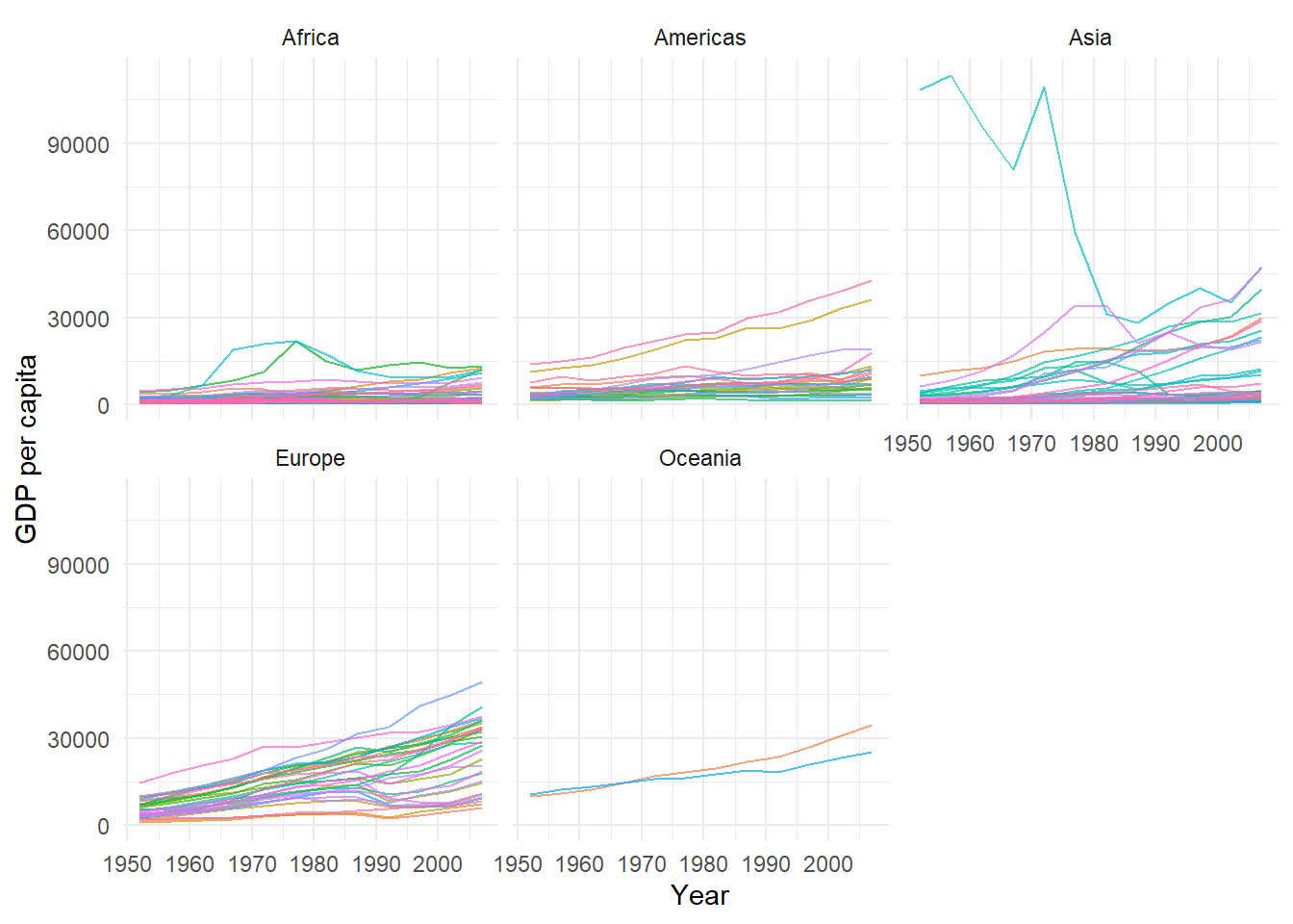
It would different to show all countries in one single chart. Suppose we are particular intereted in the following country: “United States”, “China”,“United Kingdom”,“Japan”, “Korean”.
Use a line chart to show the gdpPercap of these countries evolve over time.
sub_gapminder=gapminder[country%in%c("United States", "China","United Kingdom","Japan","Korean")]

ggplot(sub_gapminder, aes(year, gdpPercap, color = country)) +
  geom_line() +
  theme_minimal()+
  labs(x = "GDP per capita", y = "GDP Per Captia")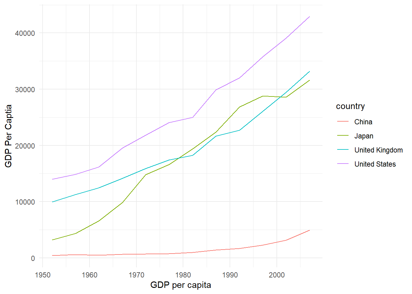
Let the line show gradually over time through animation:
p=ggplot(sub_gapminder, aes(year, gdpPercap, color = country) ) +
  geom_line(show.legend = FALSE) +
  geom_text(aes(year, gdpPercap, label=country), vjust = 0.2, hjust =0, size=4, show.legend = FALSE) +
  theme_minimal()+
  labs(x = "GDP per capita", y = "GDP Per Captia")

# create annimation
g<-p + transition_reveal(year)

h<-animate(g, renderer = gifski_renderer())
h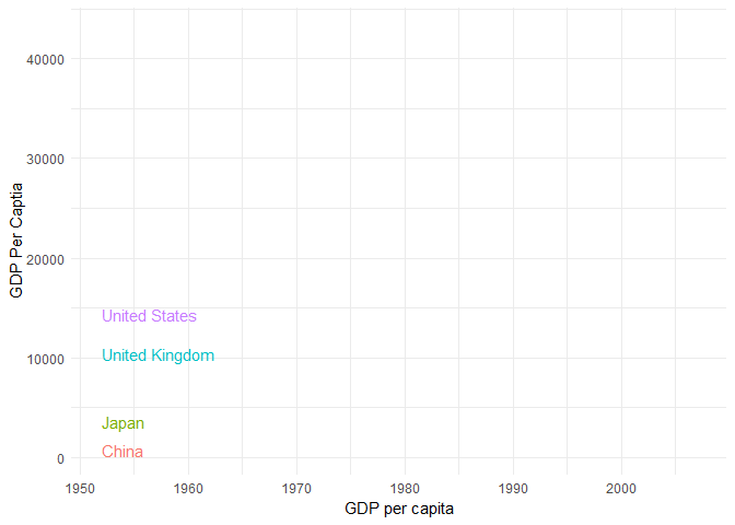
Note that the value of hjust and vjust are only defined between 0 and 1: 0 means left-justified; 1 means right-justified; hjust controls horizontal justification and vjust controls vertical justification.
17.3 Animation with Bar chart
We can make bar chart with animation to show the top n categories over time. E.g., we want to use an animation to show the top 10 country in terms of gdpPercap.
First, we need to subset the dataset to obtaint the the top 10 country in terms of gdpPercap for each year. This can be done using the powerful subsetting function in data.table package.
# select the top 10 country for each year
gapminder10 = gapminder[order(year,-gdpPercap)][, .SD[1:10],by = year]

# create rank of gdpPercap among country for each year
gapminder10[, rank:= .N:1, by = year]

head(gapminder10,15)
## year country continent lifeExp pop gdpPercap rank
## 1: 1952 Kuwait Asia 55.565 160000 108382.353 10
## 2: 1952 Switzerland Europe 69.620 4815000 14734.233 9
## 3: 1952 United States Americas 68.440 157553000 13990.482 8
## 4: 1952 Canada Americas 68.750 14785584 11367.161 7
## 5: 1952 New Zealand Oceania 69.390 1994794 10556.576 6
## 6: 1952 Norway Europe 72.670 3327728 10095.422 5
## 7: 1952 Australia Oceania 69.120 8691212 10039.596 4
## 8: 1952 United Kingdom Europe 69.180 50430000 9979.508 3
## 9: 1952 Bahrain Asia 50.939 120447 9867.085 2
## 10: 1952 Denmark Europe 70.780 4334000 9692.385 1
## 11: 1957 Kuwait Asia 58.033 212846 113523.133 10
## 12: 1957 Switzerland Europe 70.560 5126000 17909.490 9
## 13: 1957 United States Americas 69.490 171984000 14847.127 8
## 14: 1957 Canada Americas 69.960 17010154 12489.950 7
## 15: 1957 New Zealand Oceania 70.260 2229407 12247.395 6p=ggplot(gapminder10) +
geom_bar(aes(x=gdpPercap, y= factor(rank), fill = country), stat = "identity", show.legend = FALSE)+
geom_text(aes(x = -1000, y = factor(rank), label = country), vjust = 0.2, hjust = 1, size = 4,show.legend = FALSE) +
labs(x = "GDP per capita", y = NULL) +
scale_x_continuous(breaks = seq(0, 90000, 10000), expand = expansion(mult = c(.2, 0.05))) +
theme(legend.position="none",
axis.text.y = element_blank(),
axis.title.y=element_blank(),
axis.ticks.y=element_blank(),
panel.background=element_blank())
g<-p + transition_time(year) +
labs(title = "Year: {frame_time}")
# nframes: sets the total number of frames for the gif;
# fps: frames per second to control the speed of gif.
h<-animate(g, nframes = 100, fps = 10, renderer = gifski_renderer())
h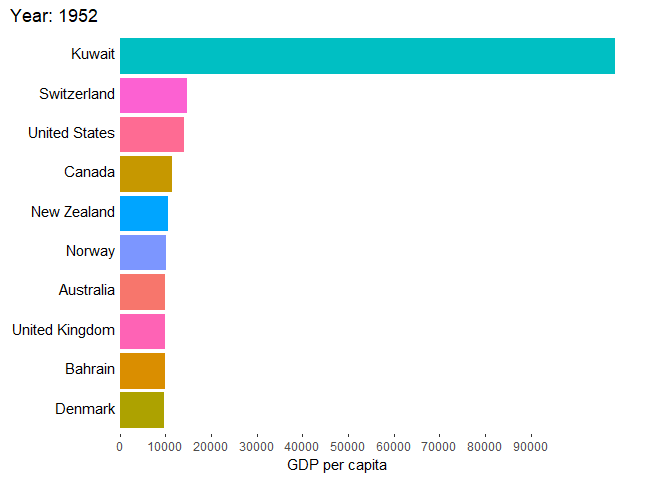
Note that:
Put the labels on the left of the datapoints by changing the horizontal alignment via hjust = 1.
I also added some space between the label and the axis by setting x = -1000
We have to add some space for the labels so that they are not cut when reaching the borders of the plot. This can be achieved by increasing the expansion of the scale via the expand argument of scale_x_continuous. I inreased the expansion at the lower end to 20 percent, while keeping the default 5 percent at the upper end.
Finally, to prevent breaks with negative values when setting x = -1000 in geom_text I force the breaks to start at 0 via breaks = seq(0, 90000, 10000).
nframes is the number of frames. The greater the number, the better the transition. This is similar to drawing cartoons. However, with more frames, the processing time is longer. R will take some more time and consume more power. fps is the amount of frame shown per second(default is 10)
Since year is a distinct value, we can also set the animation of transition with discrete state.
g<-p + transition_states(year,transition_length = 3, state_length = 1) +
  labs(title = "Year: {closest_state}")

# output GIF
h<-animate(g, nframes = 100,fps = 15, renderer = gifski_renderer())
h
In above code,
transition_length: The relative length of the transition.
state_length: The relative length of the pause at the states.