Chapter 14 Visualization with ggplot2 I
Base R has several systems for making graphs, but ggplot2 is one of the most elegant and most versatile. With ggplot2, you can do more faster by learning one system and applying it in many places. ggplot2 is probably the one of the most downloaded and well-known R-package.
Install the ggplot2 package.
Load the package into R:
For the purpose of illustration, we will use the mpg dataset bundled in ggplot2 packaged:
- mpg: This dataset contains Auto models which was released between 1999 and 2008. It shows their fuel economy data.
Let’s take a quick look at the mpg datasets:
##    manufacturer model displ year cyl      trans drv cty hwy fl   class
## 1:         audi    a4   1.8 1999   4   auto(l5)   f  18  29  p compact
## 2:         audi    a4   1.8 1999   4 manual(m5)   f  21  29  p compact
## 3:         audi    a4   2.0 2008   4 manual(m6)   f  20  31  p compact
## 4:         audi    a4   2.0 2008   4   auto(av)   f  21  30  p compact
## 5:         audi    a4   2.8 1999   6   auto(l5)   f  16  26  p compact
## 6: audi a4 2.8 1999 6 manual(m5) f 18 26 p compact## Classes 'data.table' and 'data.frame': 234 obs. of 11 variables:
## $ manufacturer: chr "audi" "audi" "audi" "audi" ...
## $ model : chr "a4" "a4" "a4" "a4" ...
## $ displ : num 1.8 1.8 2 2 2.8 2.8 3.1 1.8 1.8 2 ...
## $ year : int 1999 1999 2008 2008 1999 1999 2008 1999 1999 2008 ...
## $ cyl : int 4 4 4 4 6 6 6 4 4 4 ...
## $ trans : chr "auto(l5)" "manual(m5)" "manual(m6)" "auto(av)" ...
## $ drv : chr "f" "f" "f" "f" ...
## $ cty : int 18 21 20 21 16 18 18 18 16 20 ...
## $ hwy : int 29 29 31 30 26 26 27 26 25 28 ...
## $ fl : chr "p" "p" "p" "p" ...
## $ class : chr "compact" "compact" "compact" "compact" ...
## - attr(*, ".internal.selfref")=<externalptr>You may notice that mpg is a tibble (another extended version of data.frame). This is a data structure implement by Hadley Wickham as part of the tidyverse package. But as mentioned, we will stick to the data.table format.
14.1 Scatter plot
Let’s use our first graph to answer a question: do cars with big engines use more fuel than cars with small engines? You probably already have an answer, but try to make your answer precise. What does the relationship between engine size and fuel efficiency look like?
In the mpg dateset, displ measures a car’s engine size, in cu.in.. hwy measures its highway fuel efficiency, in miles per gallon. We will make a scatter plot between hwy and displ.
The scatter plot is the graph to show relationship between two variables. Let’s see how to make scatter plot using base R.
In base R, plot(x,y) plot a scatter plot with x on x-axis and y-axis; and displays the plot on the screen. However, ggplot2 creates a plot object that is very flexible to modify.
Now, let’s see the how to make scatter plot with ggplot2.
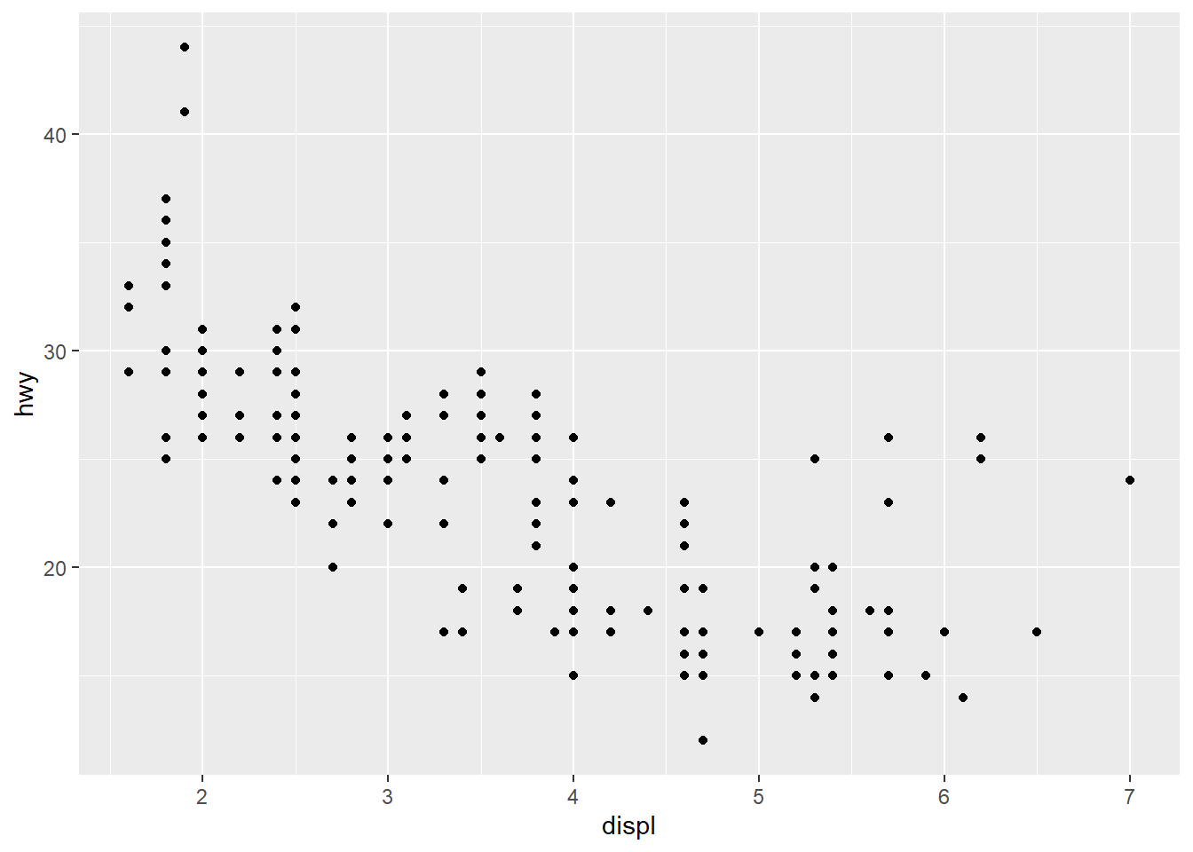
As we can see, there is a negative linear relationship between hwy and displ. In other words, cars with big engines use more fuel.
Here is what each part of the code does:
ggplot(mpg, aes(x=displ, y=hwy)) will draw a blank canvas, using data.frame mpg. aes(displ, hwy) is the mapping argument, which maps data to the visual elements in the plot. In this case, it maps displ on x-axis and hwy on the y-axis.
- is telling R that the code is not finished and the remaining code is in next line.
geom_point() plots scatter plot (i.e., points) on top the canvas, with x and y are inherited in ggplot().
The geom_point() is the function for creating scatter plot. Like geom_point(), there are other geom function to create bar charts, box charts, which we will talk later. The geom function like geom_point() takes the mapping argument, which maps the data (e.g., displ, hwy) to particular aesthetic elements of a chart (e.g., x-axis, y-axis). In the above code, geom_point() inherited the aes() from the ggplot().
Now, let’s break the code see what happens:
As mentioned, ggplot() creates an empty plot canvas, on which you can add plots layer by layer.
Unlike base R, ggplot2 creates the plot as an object and we can easily modify that object. Now, we will save the ggplot() result and then modify it by adding layer.
# create a plot object and save it to variable g
g<-ggplot(data = mpg, aes(x=displ, y=hwy))

# modify variable g by adding the scatter plot layer
g + geom_point()
As see, plots can be saved as variables, which can be added two later on using the + operator. This is really useful if you want to make multiple related plots from a common base.
A general template for making graphs with ggplot2 is as follow. To make a graph, replace the bracketed sections in the following code with a dataset, a geom function, and a collection of aesthetic mappings:
ggplot(data = , mapping = aes(
Notice that each GEOM_FUNCTION can also have its own data and aesthetic mapping to customize its corresponding layer. This provides a very flexible way of customize your charts.
The rest of this chapter will show you how to complete and extend this template to make different types of graphs.
Scatterplot is great to visualize relationship between two variables. But sometime we want to show three or even more variable at the same time. For example, we want to see how auto class (class) affects the relationship between hwy and displ. You can convey this information about your data by mapping the aesthetics in your plot to the variables in your dataset. For example, you can map the colors of your points to the class variable to reveal the class of each car.
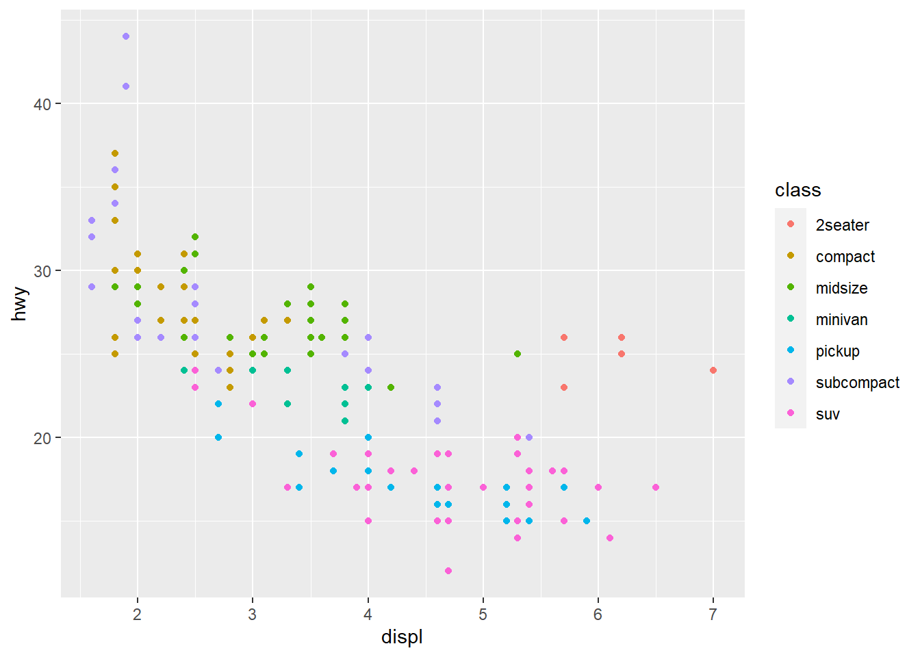
This chart is quite revealing because we see that 2seater seems to be the outlier of the linear relationship between hwy/displ. This is mostly because 2seater is like roadster with big engines.
These are the aesthetics you can consider within aes() in this chapter: x, y, color, fill, size, alpha, and shape. One common convention is that you don’t name the x and y arguments to aes(), since they almost always come first, but you do name other arguments.
If we instead assign color to cyl variable (# of cylinder), we see the legend is on a continuous scale from 4-8. But we know cylinder only takes discrete value. We need to convert cyl to factor (the data type to represent categorical variable in R) and the resulting chart is more informative.
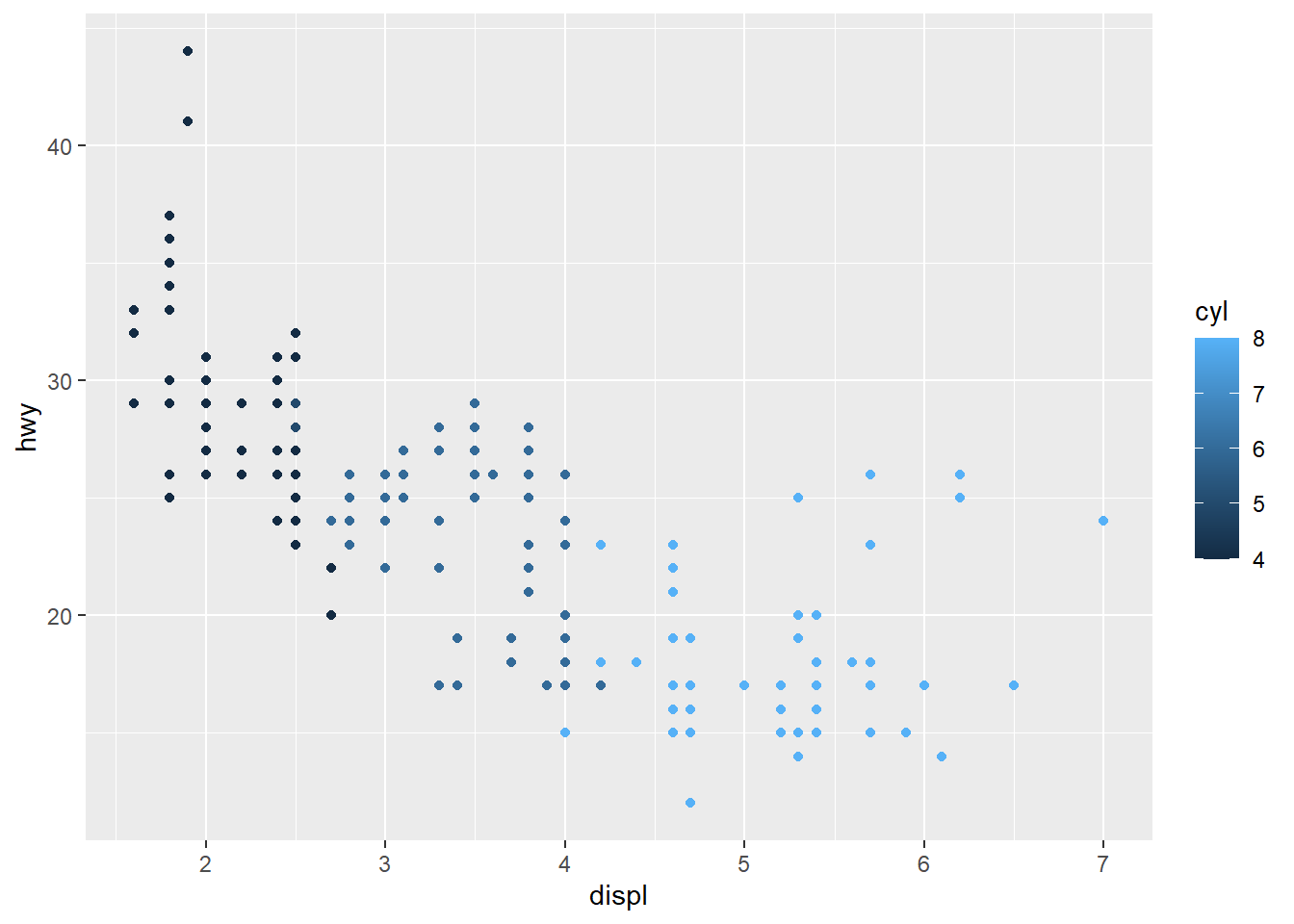
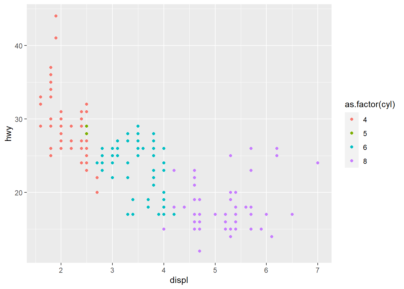
Notice that how different data type would affect the appearance of the chart. It is very critical to prepare the data in the right format before any analysis. We have talked about cleaning data in the previous chapter.
Next, we want to customize the x/y-axis and legend to make it more informative
ggplot(data = mpg, aes(displ, hwy, color=class)) +
 geom_point()+
 labs(x="displacement", y="highway miles per gallon", color="type of vehicle")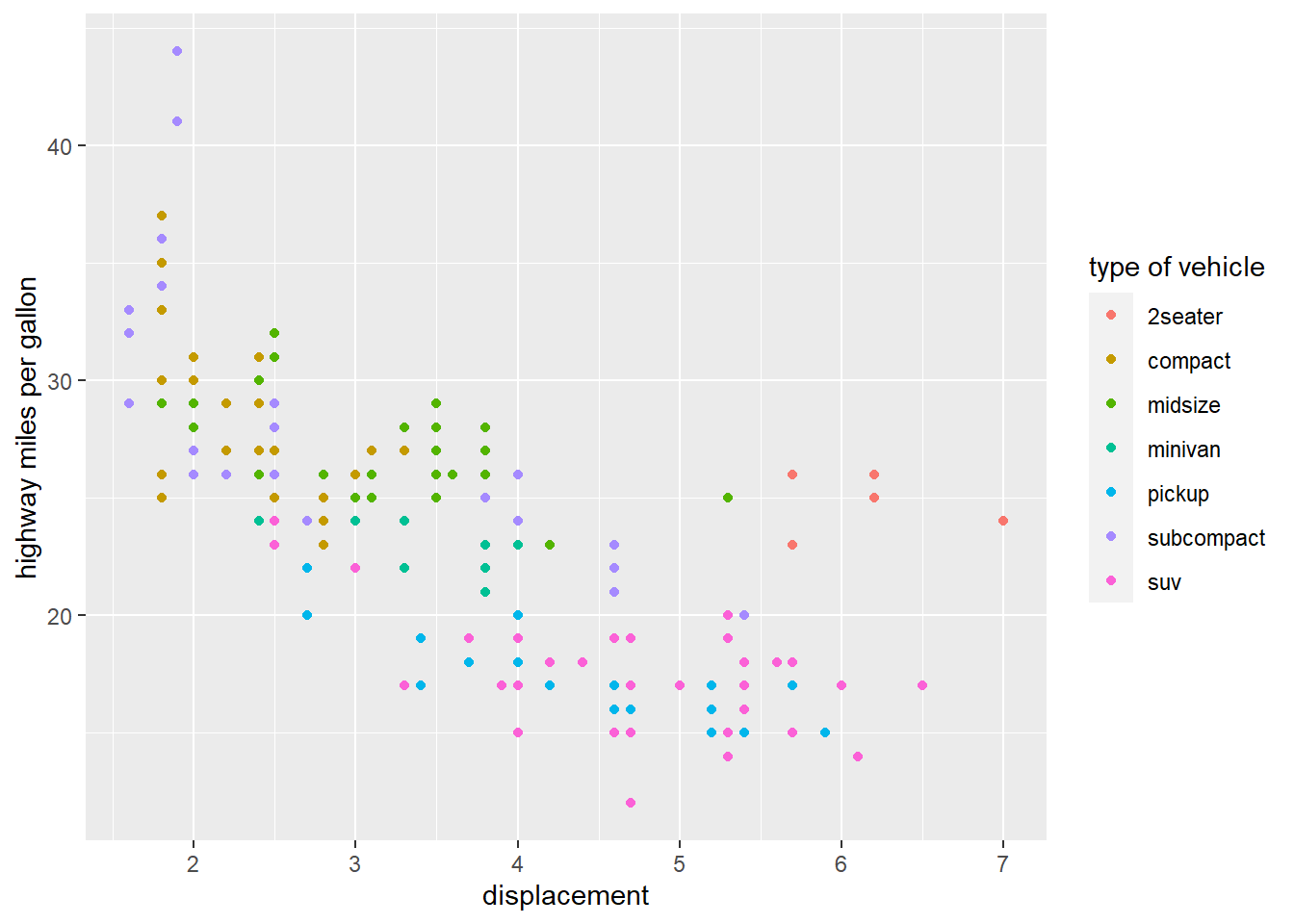
We can also use the shape of point to indicate the class.
ggplot(data = mpg, aes( displ, hwy, shape=class)) +
 geom_point()+
 labs(x="displacement", y="miles per gallon", shape="type of vehicle")
## Warning: The shape palette can deal with a maximum of 6 discrete values because
## more than 6 becomes difficult to discriminate; you have 7. Consider
## specifying shapes manually if you must have them.## Warning: Removed 62 rows containing missing values (geom_point).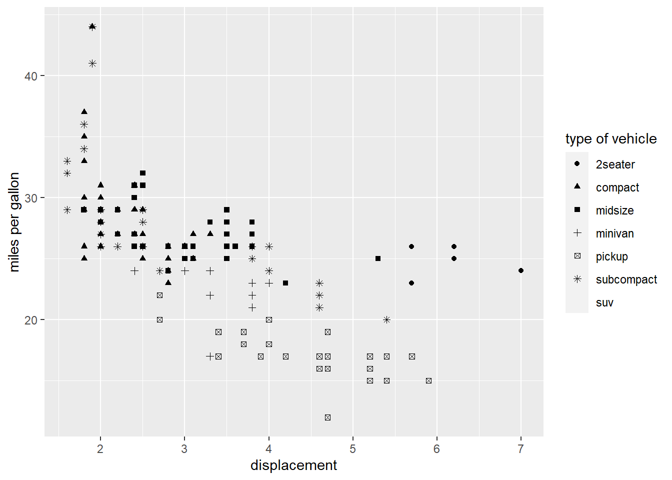
Note: that shape can deal with a maximum of 6 discrete values; try to use color if you have more than 6 discrete value for a categorical variable.
If we want to include a continuous variable into the chart, i.e., including cty (miles per gallon in city) of a car, we can use the size aes() element.
ggplot(data = mpg, aes( displ,  hwy, size=cty)) +
 geom_point()+
 labs(x="displacement", y="miles per gallon") +
  theme(legend.position = "none")  # remove the legend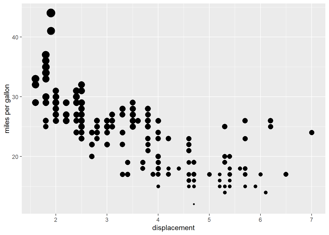
In this plot, the size of the circle represents the cty of the car.
One way to add additional variables is with aesthetics (e.g., color, fill, shape, size). Another way, particularly useful for categorical variables, is to split your plot into facets (i.e., subplots) each of which displays one subset of the data. It also reduces the complexity of a chart and allow readers to focus on one category at a time.
ggplot(data = mpg, aes(displ, hwy, color=class)) +
 geom_point()+
  labs(x="displacement", y="miles per gallon") +
  theme(legend.position = "none") +
  facet_wrap(~ class, nrow = 3)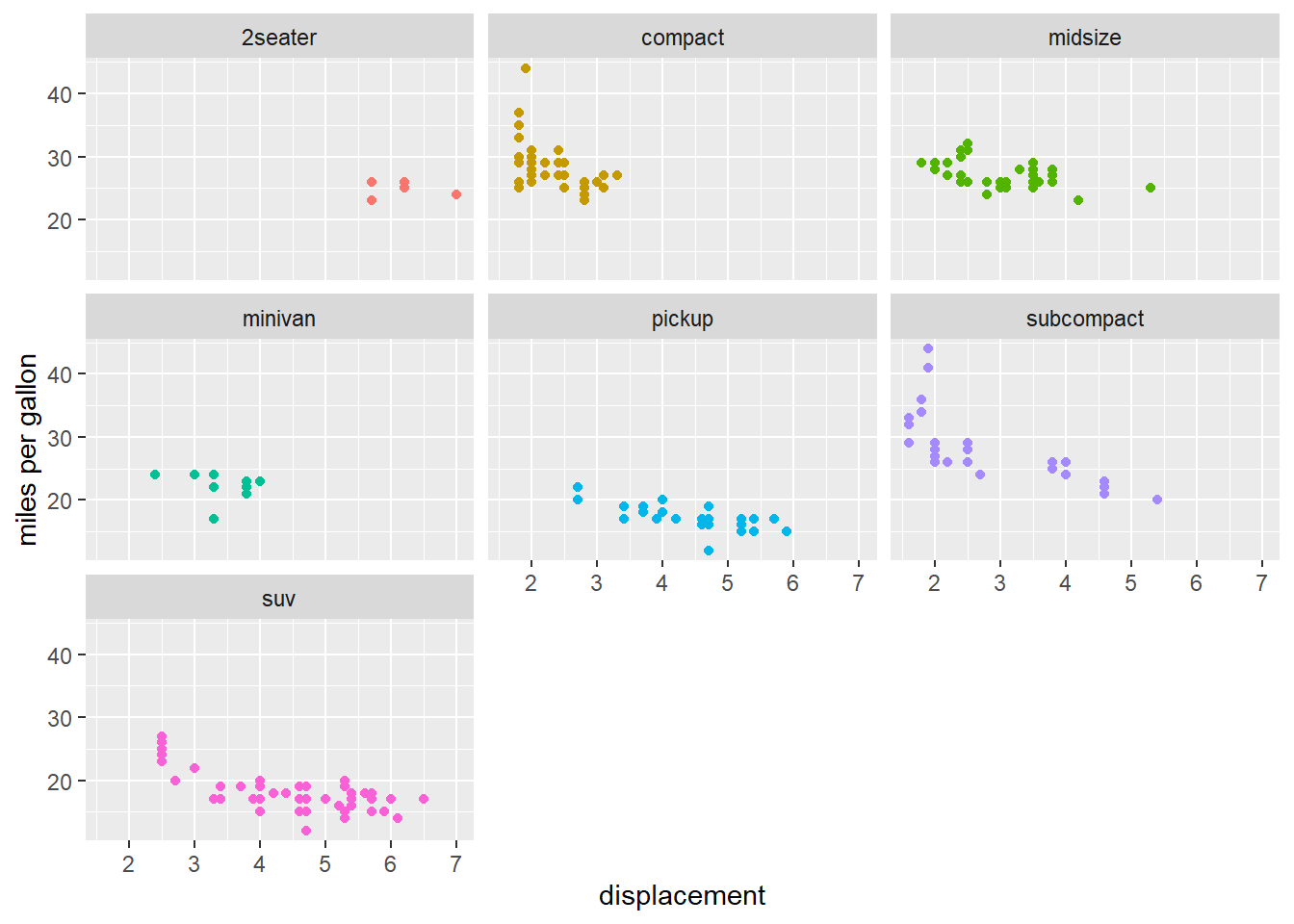
This chart clearly shows that compact has great advantage in fuel economy.
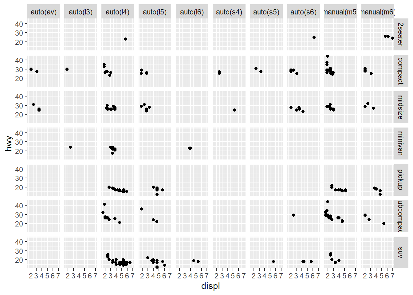
To facet your plot on the combination of two discrete variables, add facet_grid() to your plot call. The first argument of facet_grid() is a formula. This time the formula should contain two variable names separated by a ~:
14.2 line-fitting
Next, we will add a fitted line to the scatter plot. The fitted line is a great way to visualize the potential linear/nonlinear relationship between two variables. To add a fitted line, we simply include the geom_smooth() on top of the chart.
ggplot(data = mpg, aes(displ, hwy)) +
 geom_point()+
 geom_smooth()   # fit scatter plot using the default method LOESS (locally estimated scatterplot smoothing)
## `geom_smooth()` using method = 'loess' and formula 'y ~ x'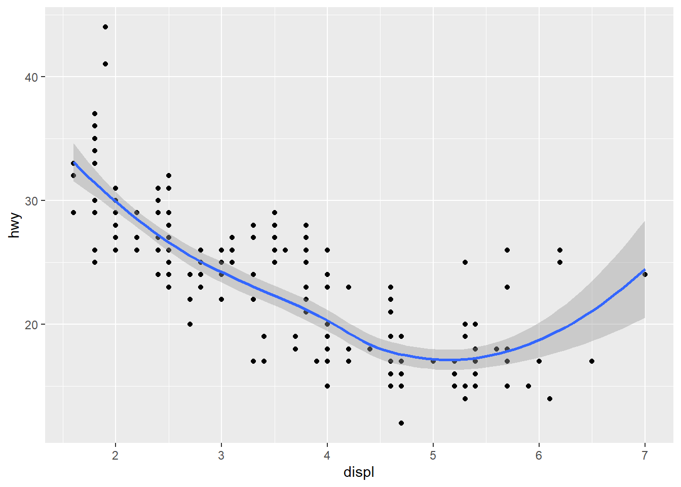
The band round the fitted line is the 95% prediction interval (i.e., with 95% probability, the hwy for an Auto with given displ should fall in such interval). To remove the interval, we can set se=FALSE as below:
ggplot(data = mpg, aes(displ, hwy)) +
 geom_point()+
 geom_smooth(se=FALSE)   # fit scatter plot using the default method LOESS (locally estimated scatterplot smoothing)
## `geom_smooth()` using method = 'loess' and formula 'y ~ x'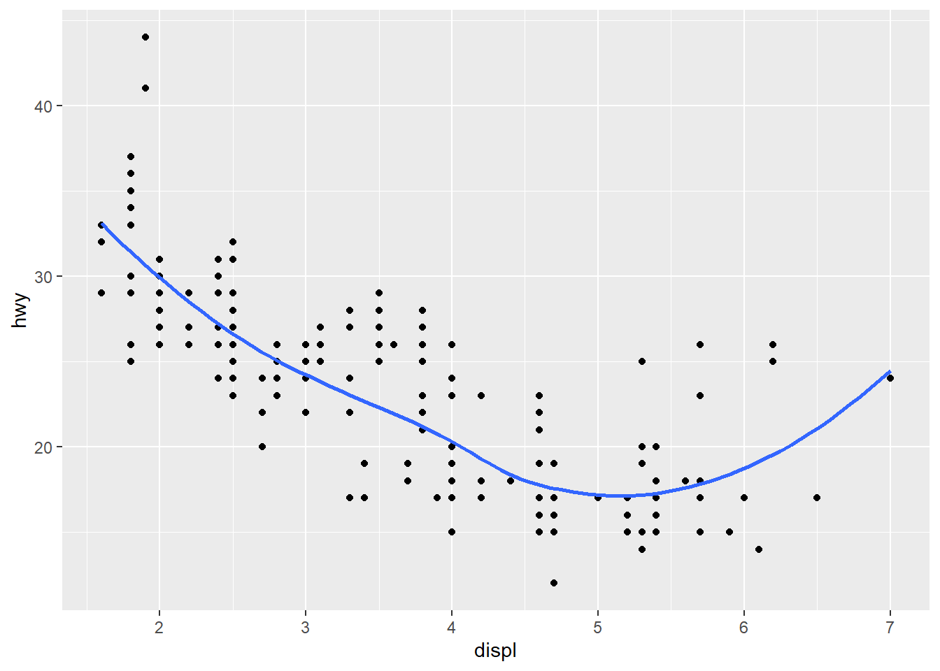
The fitted curve is bended upwards, due to the few outlier on the up-right corner (i.e., the 2seaters auto class). This creates a FALSE visual impression that hwy actually is improved when the engine is sufficiently large. To correct such FALSE impression, we can remove the outliers when adding the geom_smooth() layer.
ggplot(data = mpg, aes(displ, hwy)) +
 geom_point()+
 geom_smooth(data = mpg[mpg$class!="2seater",], aes(x=displ, y=hwy))   # remove the 2seater class as outlier when fitting the scatter plot
## `geom_smooth()` using method = 'loess' and formula 'y ~ x'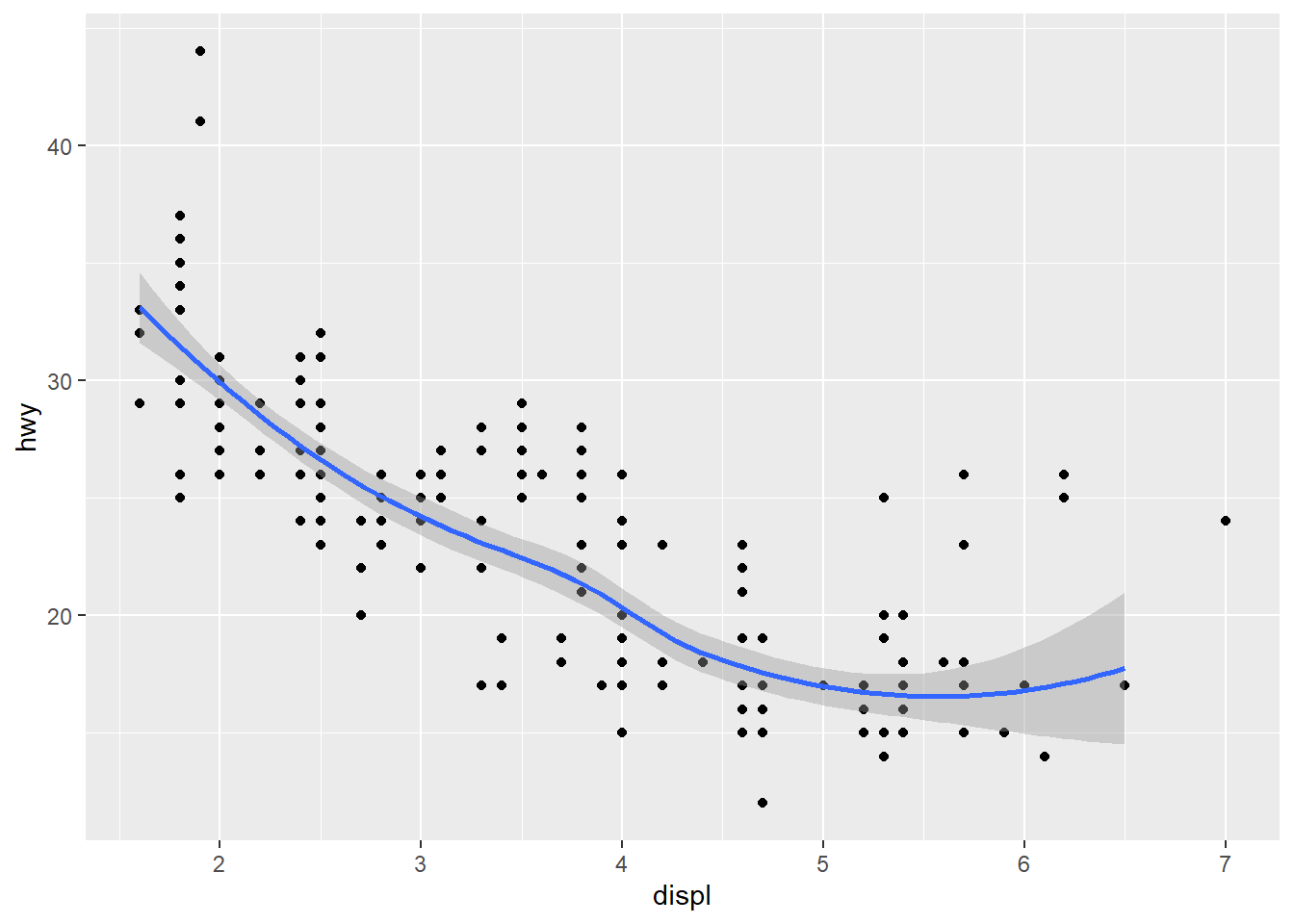
Once the outliers are removed, the fitted line is no longer bended upwords. In the code above, geom_smooth() override the data and aesthetic inherited from ggplot(), and use its own data and aesthetic. This shows the great flexibility of ggplot2.
In many case, we want to fit the scatter plot with linear line due to is clear interpretation. We can easily do that by changing the fitting method to “lm”.
ggplot(data = mpg, aes(displ, hwy)) +
 geom_point()+
 geom_smooth(se=FALSE, method="lm")+  # fit the scatter plot with linear line
  geom_smooth(data = mpg[mpg$class!="2seater",], aes(x=displ, y=hwy),method="lm", se=FALSE, color="red")     # fit the scatter plot with linear line without outliers
## `geom_smooth()` using formula 'y ~ x'
## `geom_smooth()` using formula 'y ~ x'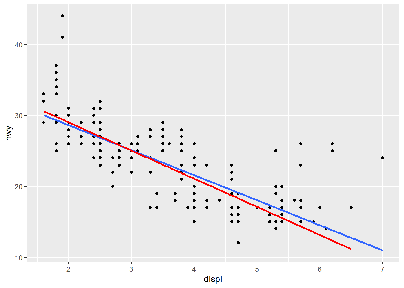
If you have multiple geoms, then mapping an aesthetic to data variable inside the call to ggplot() will change all the geoms. It is also possible to make changes to individual geoms by passing arguments to the geom_*() functions.
14.3 Overplotting
Did you notice that the plot displays only 126 points, even though there are 234 observations in the dataset? Also, no a single point overlay each other in the above chart. The values of hwy and displ are rounded so the points appear on a grid and many points overlap each other. This problem is known as overplotting.
You can avoid this gridding by setting the position adjustment to “jitter.” position = “jitter” adds a small amount of random noise to each point. This spreads the points out because no two points are likely to receive the same amount of random noise:
ggplot(mpg, aes(displ, hwy)) +
 geom_point(position="jitter", alpha=0.4)  # alpha sets the transparency of the point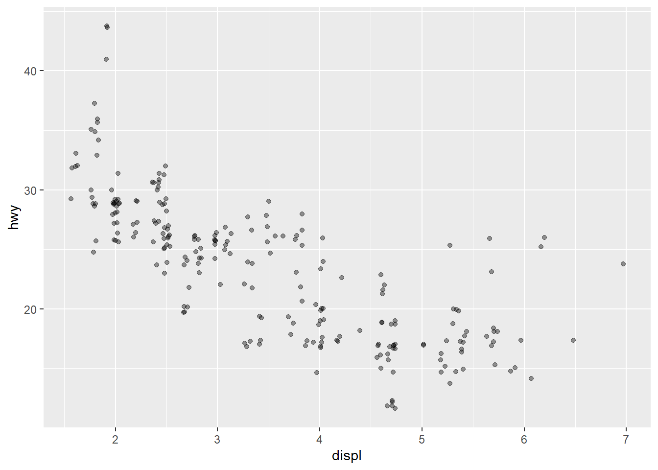
geom_point() has an alpha argument that controls the opacity of the points. A value of 1 (the default) means that the points are totally opaque; a value of 0 means the points are totally transparent (and therefore invisible). Values in between specify transparency.
we must always consider overplotting, particularly in the following four situations:
Large datasets
Aligned values on a single axis
Low-precision data
Integer data
For example, the diamonds datast (also bundled with ggplot2 package) contains over 50,000 diamonds in terms their price, carat, clarity ….. You can plot the scatter plot for between carat and price for the diamonds dataset.
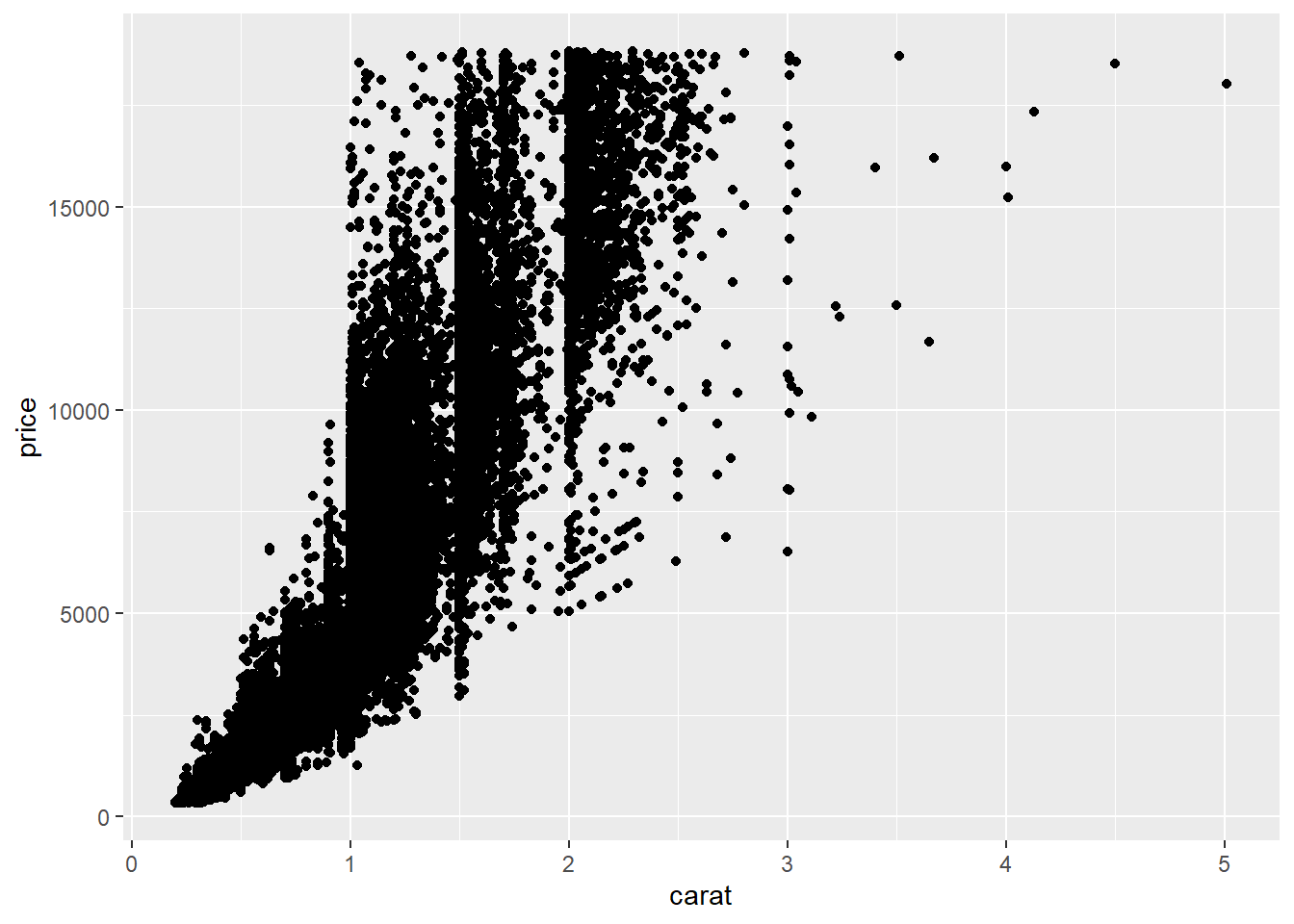
This is a very large dataset, it is a best practice to set position=“jitter” to aviod over ploting.
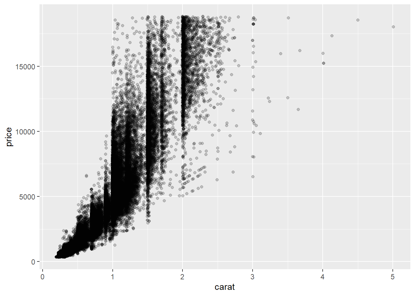
As seen in above chart, the jitter plot gives a strong visual clue of where most data is clustered.
We can also customize the random disturbance in the point position using position_fitter(width), where width indicates how much random disturbance in the points.
ggplot(diamonds,aes(x=carat, y=price))+
  geom_point(position = position_jitter(0.2), alpha=0.1)  # setting the width to 0.2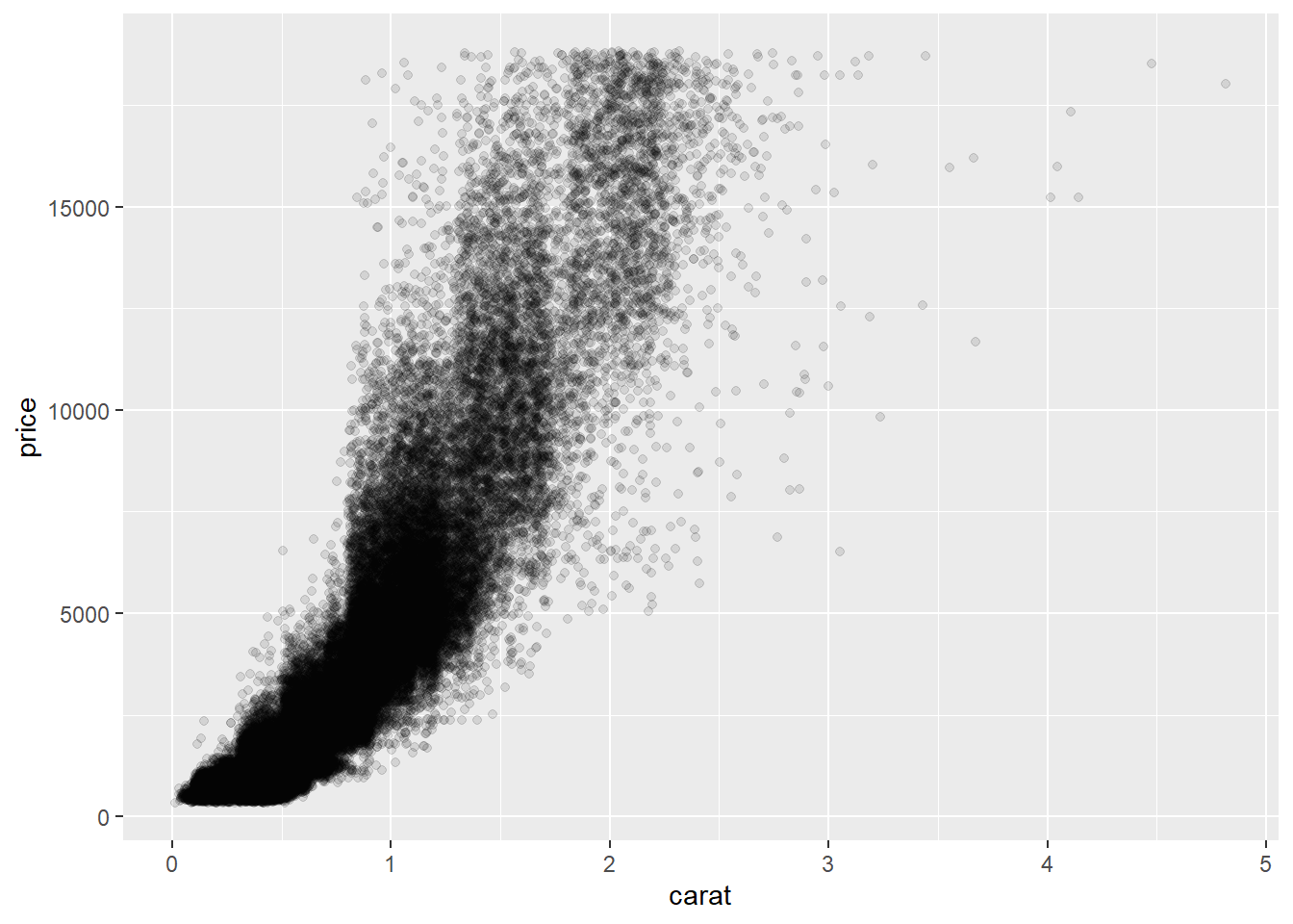
14.4 Bar chart and statistical transformation
Now, suppose we want to plot the number of Auto produced by each manufacturer using a bar chart. This can be done directly with geom_bar() function.
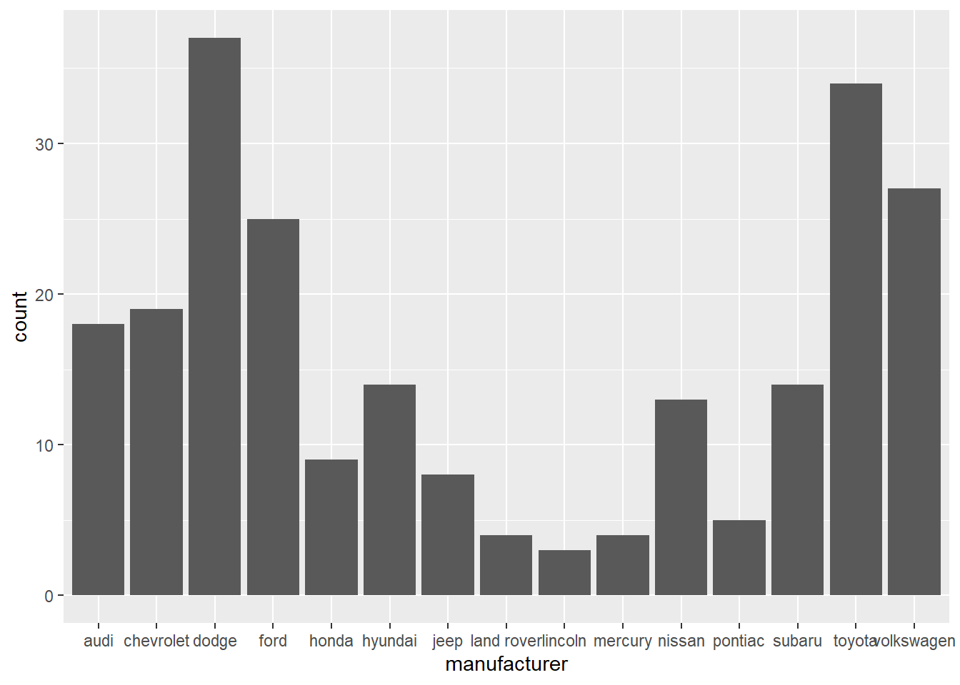
On the x-axis, the chart displays manufacturer, a variable from mpg dataset. On the y-axis, it displays count, but count is not a variable in mpg! Where does count come from? Many graphs, like scatterplots, plot the raw values of your dataset. Other graphs, like bar charts, calculate new values to plot:
Bar charts, histograms, and frequency polygons bin your data and then plot bin counts, the number of points that fall in each bin.
geom_smooth fit a model to your data and then plot predictions from the model.
Boxplots compute a robust summary of the distribution and display a specially formatted box.
The algorithm used to calculate new values for a graph is called a stat, short for statistical transformation.
Let’s look at one example. The sample data shows the teaching evaluation of the three SCMA courses.
##    course evaluation
## 1 SCMA350        3.8
## 2 SCMA450        4.1
## 3 SCMA451        4.1
We want to plot the evaluation score of each course on a bar chart.
# this will generate a count for each category and plot count on y-axis.
ggplot(data=myData)+
  geom_bar(mapping=aes(x=course))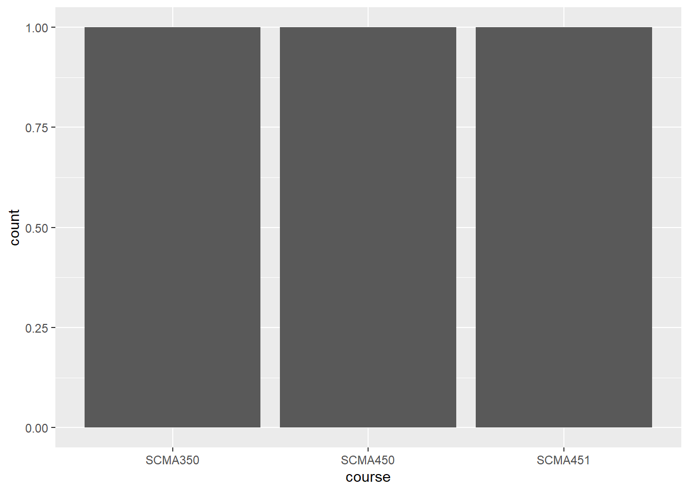
The y-axis is count; in other words, the code above counts the occurance of each course and plot that on the y-axis. To plot the evaluation data as it is, we need to set the y-axis as evaluation and set stat function as “identity”.
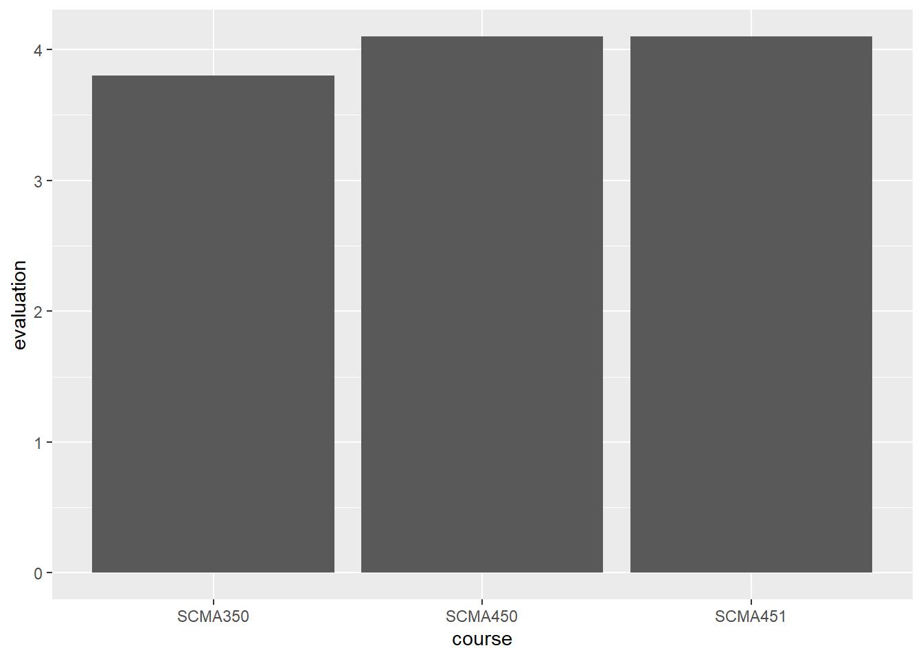
stat = “identity” tells the program to plot the data as it is, rather than generating the counts.
Now, plot a bar chart to show the average hwy for each manufacturer. In this case, we need to use the stat function for computing average.
# Plot a horizontal bar chart
ggplot(mpg, aes(x = manufacturer , y = hwy)) +
  # Add a bar summary stat of means, colored skyblue
stat_summary(fun = mean, geom = "bar", fill = "skyblue") 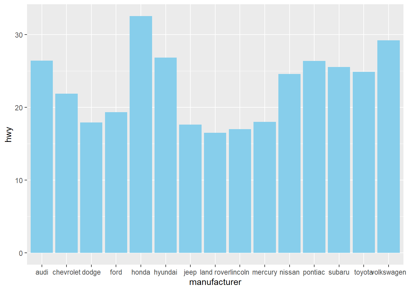
We can switch the x-axis and y-axis of a vertical bar chart so that the label for each manufacturer does not overlay each other.
# Plot a horizontal bar chart
ggplot(mpg, aes(x = manufacturer , y = hwy)) +
  # Add a bar summary stat of means, colored skyblue
  stat_summary(fun = mean, geom = "bar", fill = "skyblue", color="skyblue") +
  labs(x="manufacturer", y="highway miles per gallon")+ # add x/y labels
  coord_flip()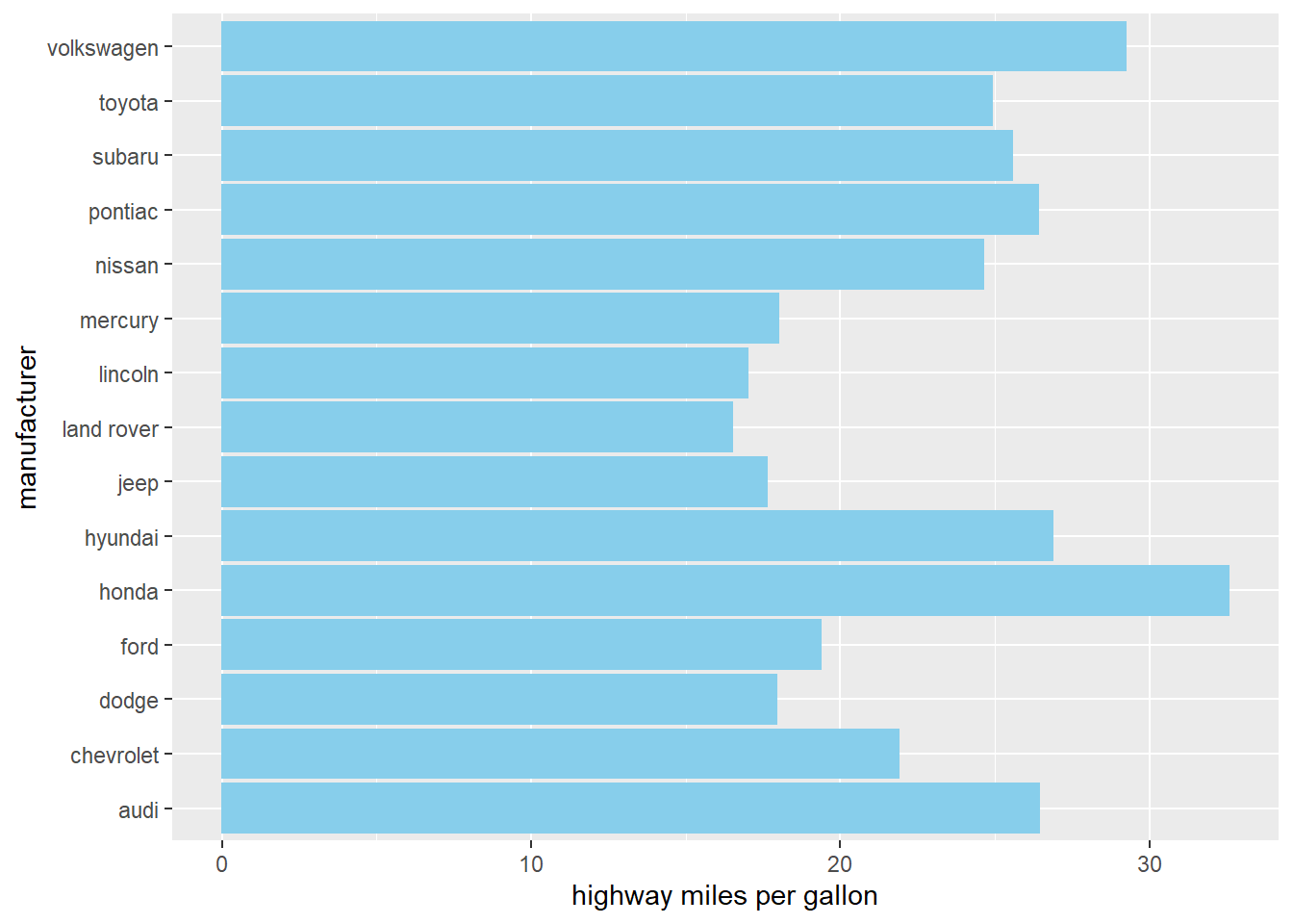
Or we can switch the x-y axis in the aes() mapping:
# Plot a horizontal bar chart
ggplot(mpg, aes(x = hwy, y = manufacturer)) +
  # Add a bar summary stat of means, colored skyblue
  stat_summary(fun = mean, geom = "bar", fill = "skyblue", color="skyblue") +
  labs(x="highway miles per gallon", y="manufacturer") # add x/y labels
We can add more detail information to the chart by showing each points through geom_point()
# Plot a horizontal bar chart
ggplot(mpg, aes(x = manufacturer , y = hwy)) +

  # Add a bar summary stat of means, colored skyblue
  stat_summary(fun = mean, geom = "bar", fill = "skyblue", color="skyblue", alpha=0.3)+

  # add points to show the hwy of each Auto under the same manufacturer
  geom_point(position=position_jitter(width = 0.1), alpha=0.5)+

  labs(x="manufacturer", y="highway miles per gallon")+ # add x/y labels
  coord_flip()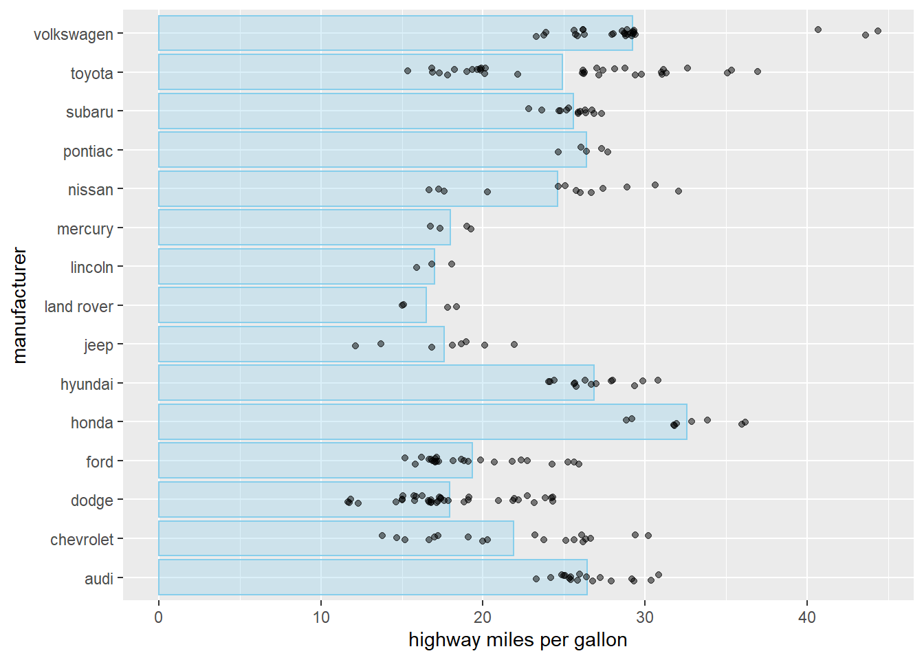
14.5 stacked par
In some cases, we want to show the composition of each bar. Stacked bar chart is for this purpose.
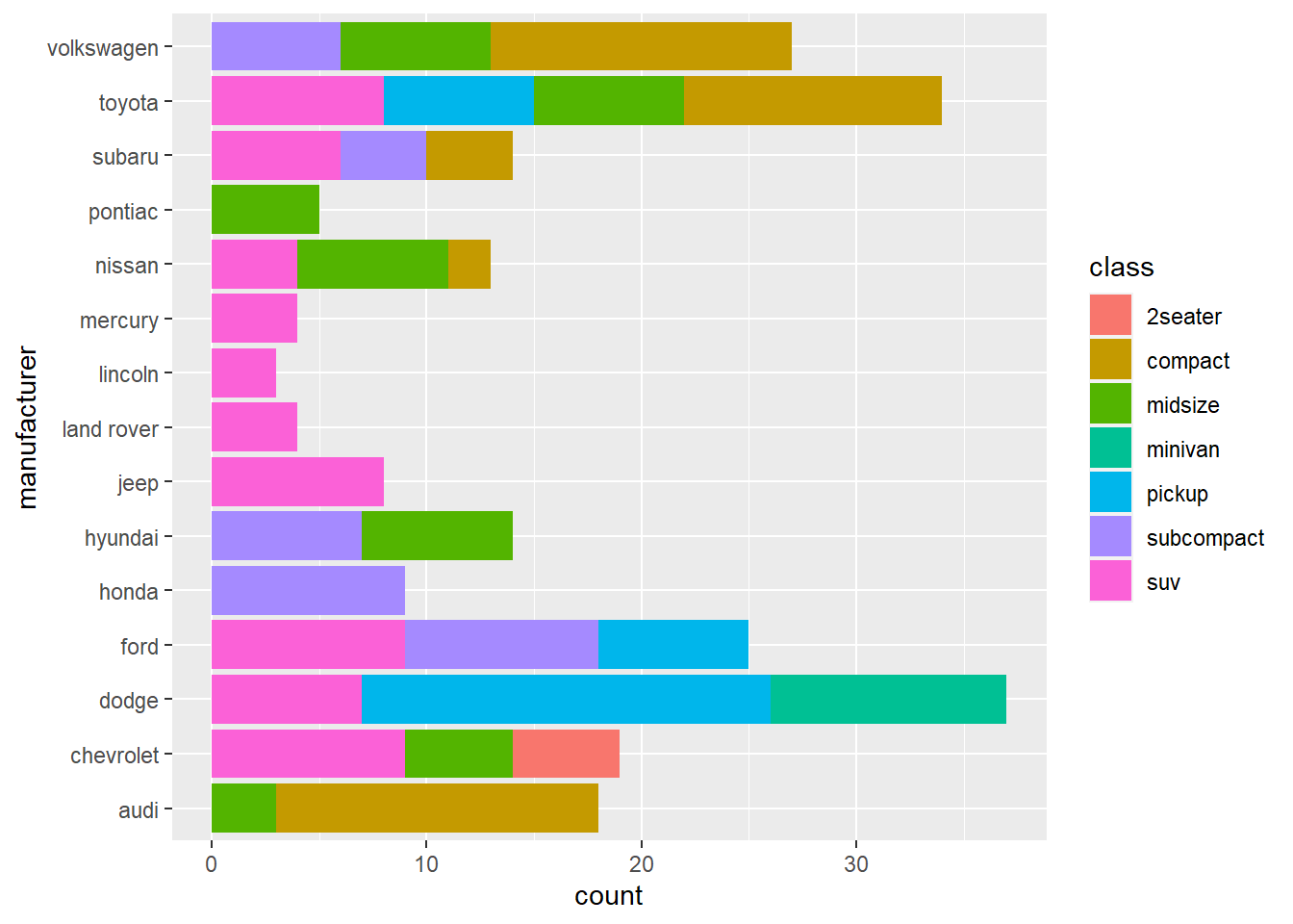
The above charts shows how many types of car each manufacturer has.
We can also stack bar side-by-side.
ggplot(mpg, aes(x =hwy, y = manufacturer, fill=class)) +
  stat_summary(fun = mean, geom = "bar", position = position_dodge2(width = 4, preserve = "single"))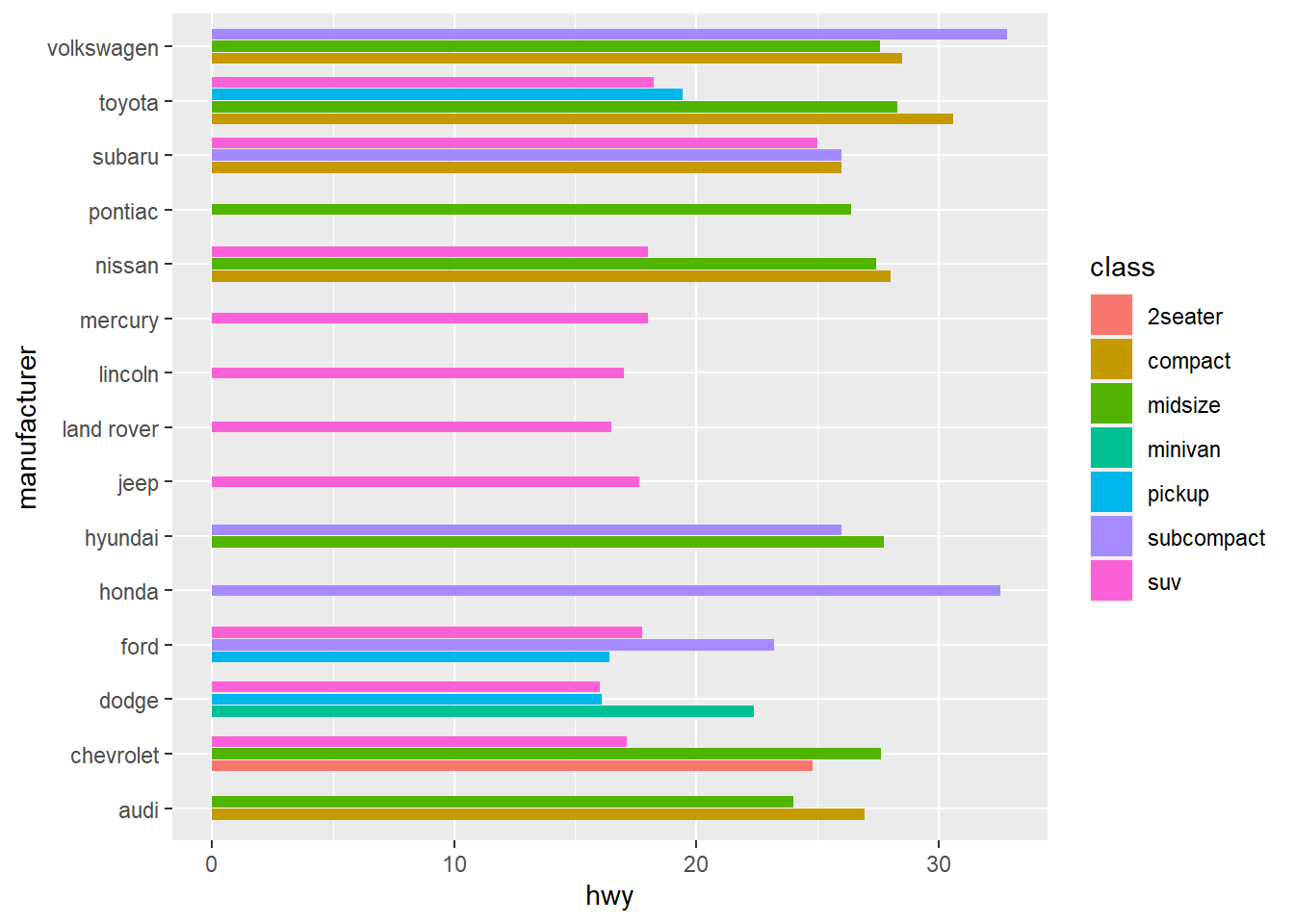
Again, we can facet the plot into subplot to show each sub-category.
ggplot(mpg, aes(x =hwy, y = manufacturer, fill=class))+
  stat_summary(fun = mean, geom = "bar")+
  facet_wrap(~class, nrow=7)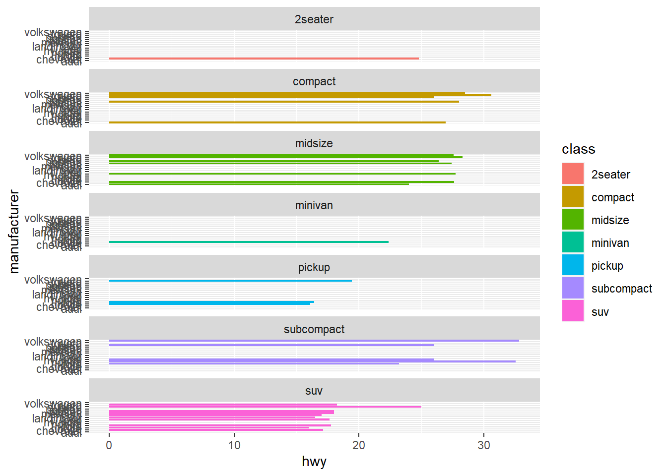
14.6 Histogram
Histogram is a great to see the distribution of a variable.
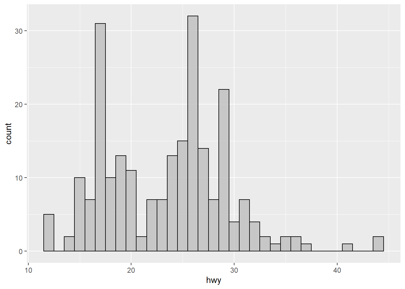
Histogram by group using facet_wrap() function
ggplot(mpg, mapping=aes(x=hwy)) +
  geom_histogram(binwidth=1, color="black", fill="gray")+
  facet_wrap(~ drv, nrow = 3) +
  coord_fixed(ratio=0.3)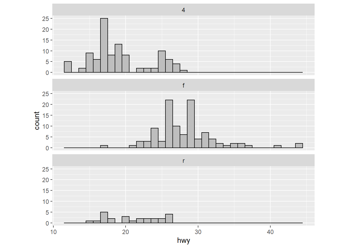
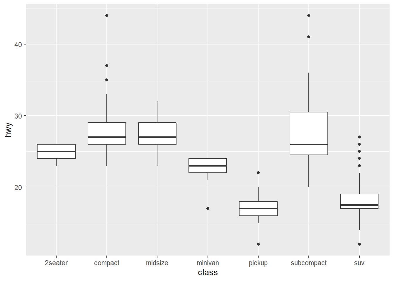
14.7 boxplot
Boxplot is a great way to show the median as well as its spread of a variable.
14.8 line chart
Line chart is usually used to show how a variable change over time. We will use the economics dataset which contains the US economic time series.
## # A tibble: 6 x 6
##   date         pce    pop psavert uempmed unemploy
##   <date>     <dbl>  <dbl>   <dbl>   <dbl>    <dbl>
## 1 1967-07-01  507. 198712    12.6     4.5     2944
## 2 1967-08-01  510. 198911    12.6     4.7     2945
## 3 1967-09-01  516. 199113    11.9     4.6     2958
## 4 1967-10-01  512. 199311    12.9     4.9     3143
## 5 1967-11-01  517. 199498    12.8     4.7     3066
## 6 1967-12-01  525. 199657    11.8     4.8     3018
Use a line chart to show how uempmed(unemployment rate) evolve over time:
ggplot(economics, aes(date, uempmed)) +
  geom_line(alpha = 0.7) +
  labs(x = "date", y = "unemployment rate")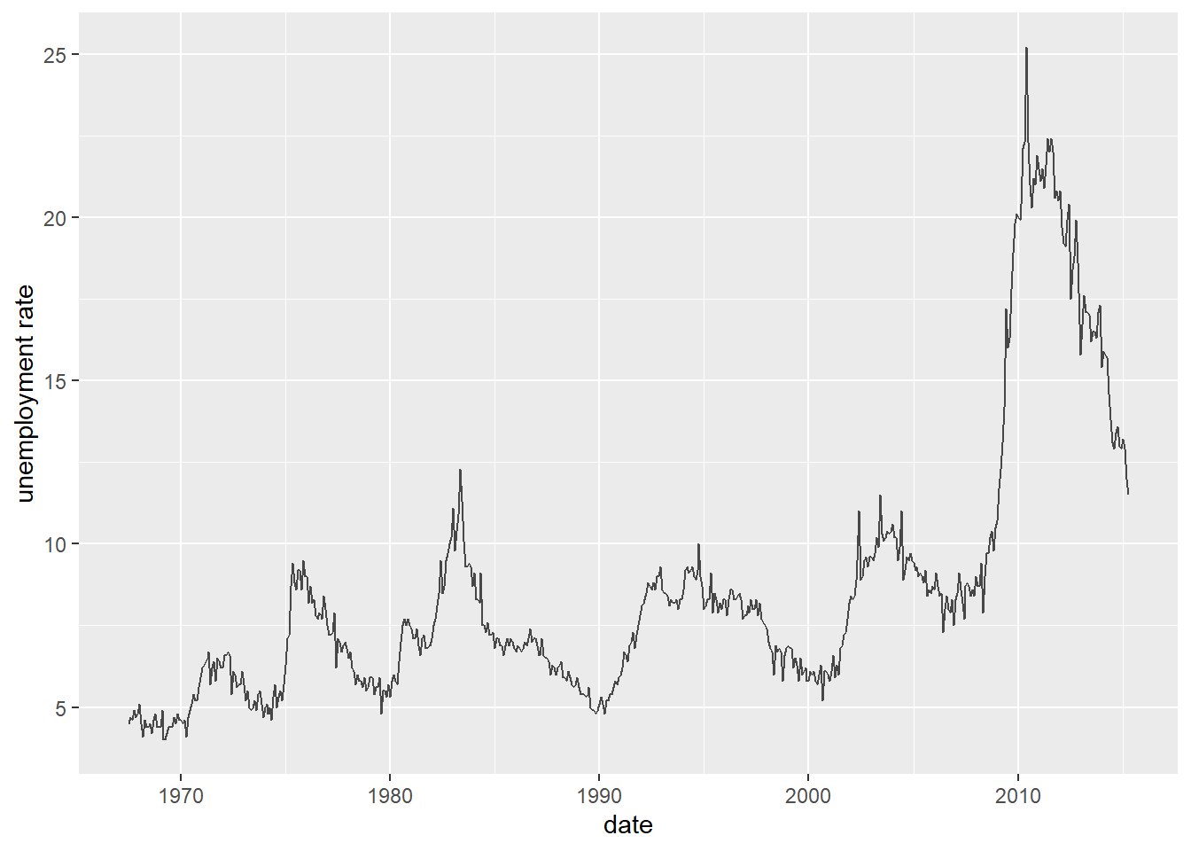
Use a line chart to show how pce(personal consumption expenditures, in billions $) evolve over time:
ggplot(economics, aes(date, pce)) +
  geom_line(alpha = 0.7) +
  labs(x = "date", y = "personal consumption expenditures")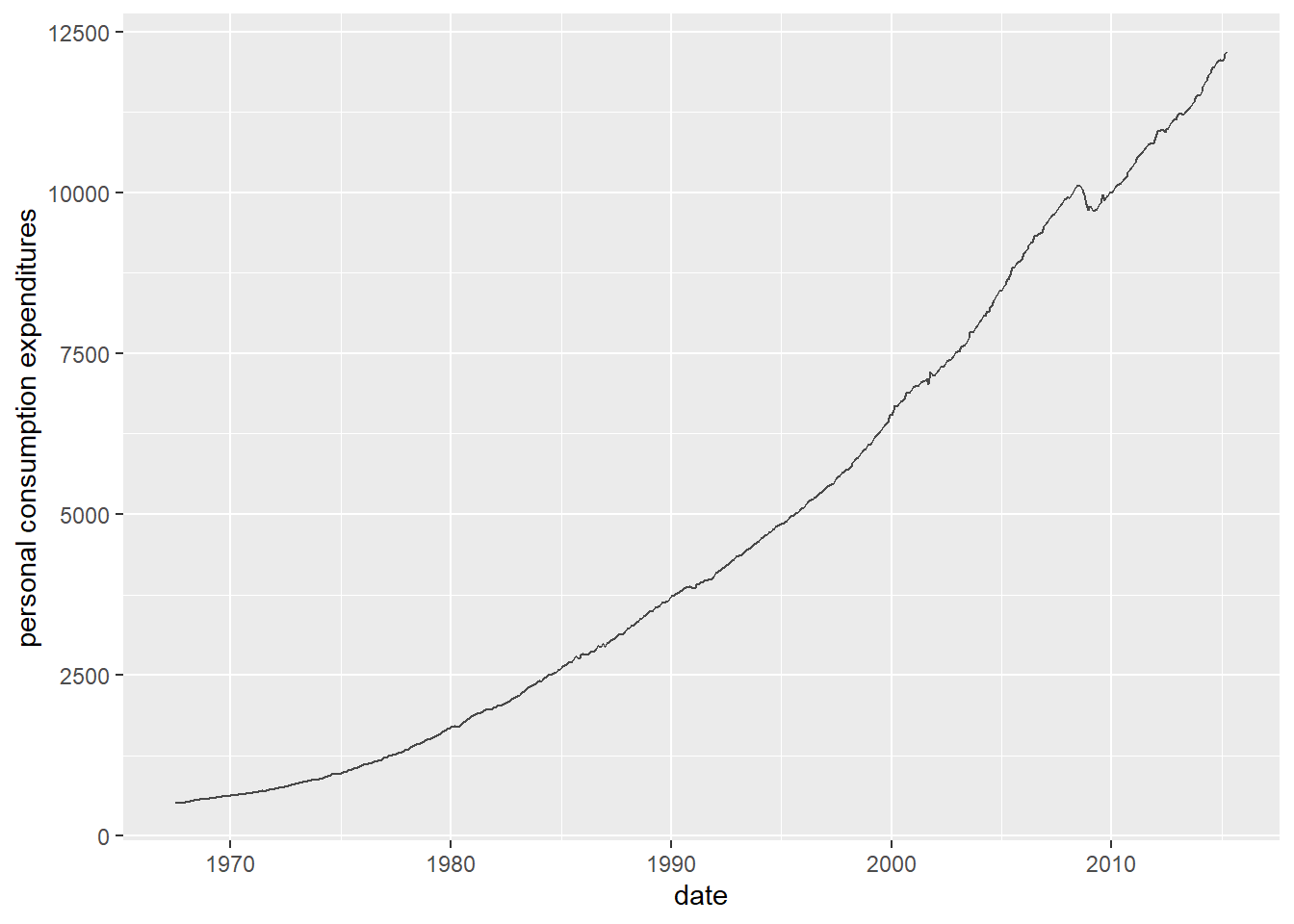
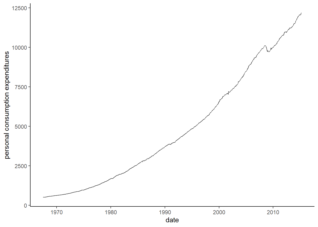
14.9 use theme to customize the appearance of your chart.
Many plot elements have multiple properties that can be set. For example, line elements in the plot such as axes and gridlines have a color, a thickness (size), and a line type (solid line, dashed, or dotted). To set the style of a line, you use element_line(). For example, to make the axis lines into red, dashed lines, you would use the following.
g=ggplot(economics, aes(date, pce)) +
  geom_line(alpha = 0.7) +
  labs(x = "date", y = "personal consumption expenditures")

g + theme(axis.line = element_line(color = "red", linetype = "solid"))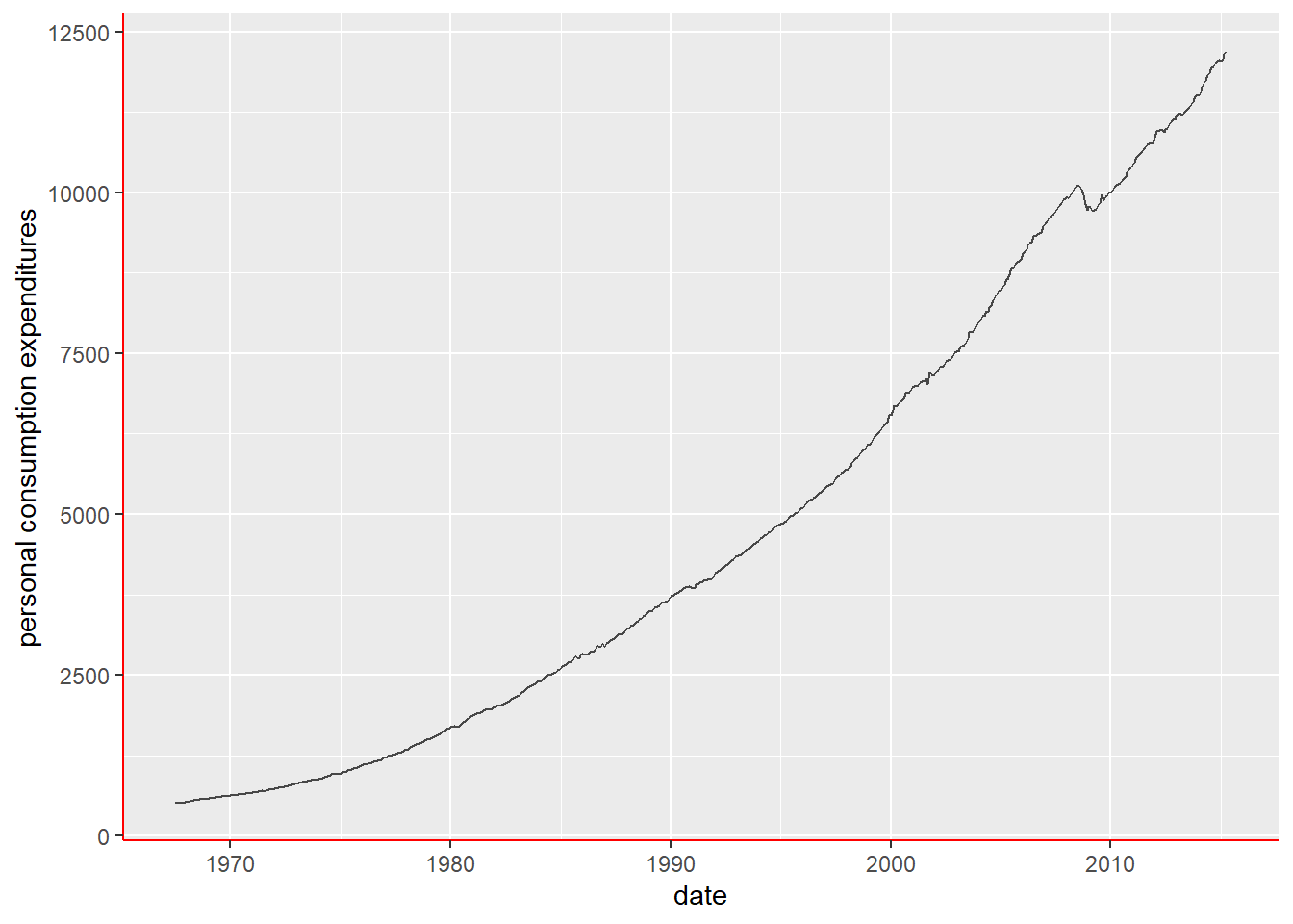
Built-in themes: In addition to making your own themes, there are several out-of-the-box solutions that may save you lots of time.
theme_gray() is the default.
theme_bw() is useful when you use transparency.
theme_classic() is more traditional.
theme_void() removes everything but the data.
The theme_classic() is the my go-to-theme.
When the x/y axis goes too high, we may want to compress the axis through log-transformation.

14.10 Summary
The general syntax for ggplot() is: ggplot(data = DATA, mapping = aes(MAPPINGS)) + GEOM_FUNCTION(data = DATA, mapping = aes(MAPPINGS))
To make a graph, replace the bold sections in the above code with a dataset, a geom function, and a collection of aesthetic mappings.
We use geom_point() function to make scatter plot: Scatter plot can plot two variables on the x/y axis.
To include more information on scatter plot, we can use aesthetic (e.g., color, fill, shape, size). It is the best practice to map discrete variables to color, fill, shape, while continuous variable to size. We can also use facet to create sub-plot for each sub-category.
Use geom_smooth() to add fitted line to the scatter plot.
Set position=“jitter” to add random disturbance to avoid overplotting.