Chapter 15 Visualization with ggplot2 II
In previous chapter, we learn the general syntax for ggplot() as below: ggplot(data = DATA, mapping = aes(MAPPINGS)) + GEOM_FUNCTION(data = DATA, mapping = aes(MAPPINGS))
To make a graph, replace the bold sections in the above code with a dataset, a geom function, and a collection of aesthetic mappings. We have learned the geom_functions, geom_point() and geom_smooth() for making scatter plot and adding fitted line on scatter plot.
Today, we will introduce geom_bar(), geom_line, geom_box for making bar/line/box plot. We will introduce how to use theme() function to beautify the plots.
15.1 Bar chart and statistical transformation
Now, suppose we want to plot the number of Auto produced by each manufacturer using a bar chart. This can be done directly with geom_bar() function.
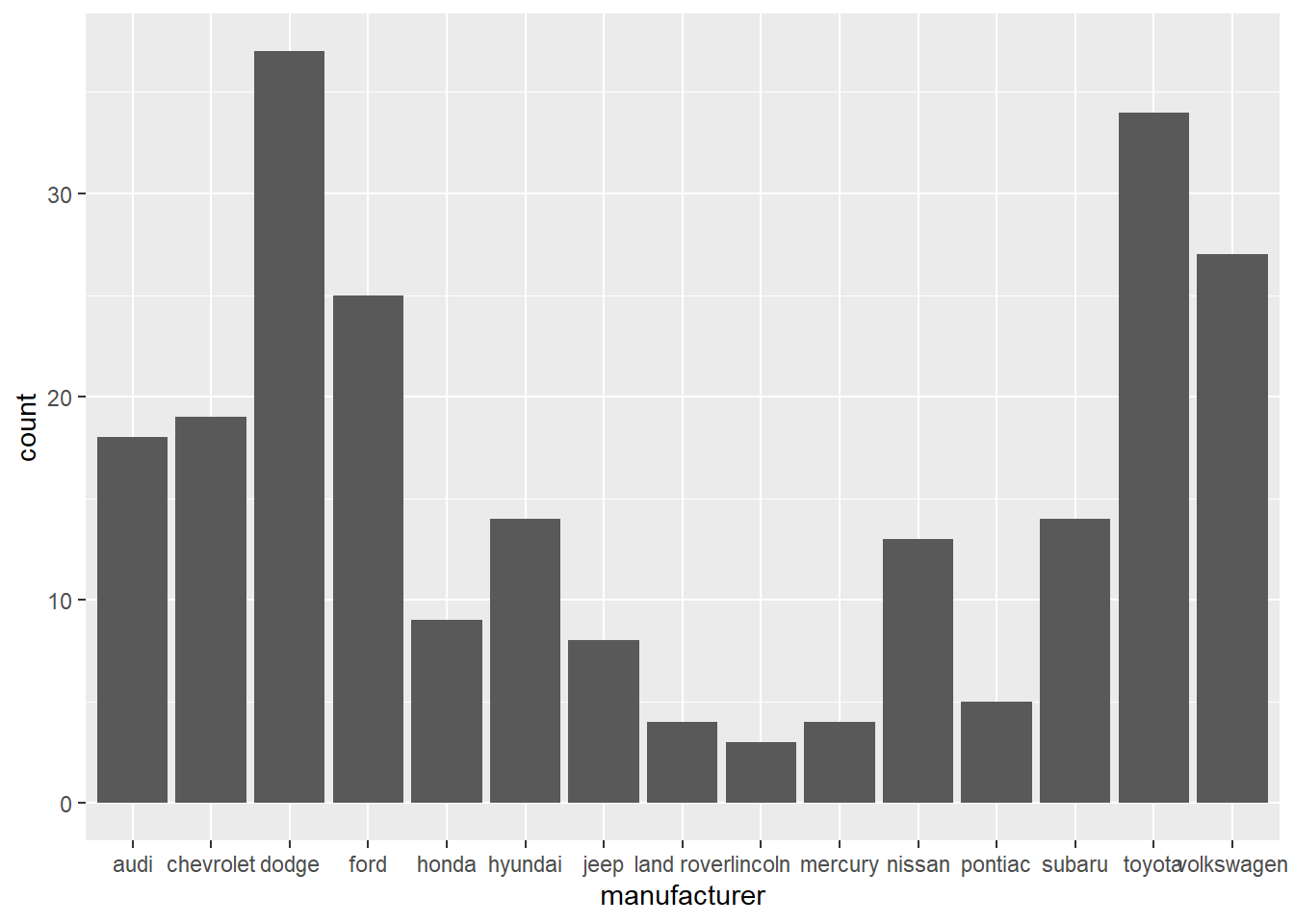
On the x-axis, the chart displays manufacturer, a variable from mpg dataset. On the y-axis, it displays count, but count is not a variable in mpg! Where does count come from? Many graphs, like scatterplots, plot the raw values of your dataset. Other graphs, like bar charts, calculate new values to plot:
Bar charts, histograms, and frequency polygons bin your data and then plot bin counts, the number of points that fall in each bin.
geom_smooth fit a model to your data and then plot predictions from the model.
Boxplots compute a robust summary of the distribution and display a specially formatted box.
The algorithm used to calculate new values for a graph is called a stat, short for statistical transformation.
Let’s look at one example. The sample data shows the teaching evaluation of the three SCMA courses.
##    course evaluation
## 1 SCMA350        3.8
## 2 SCMA450        4.1
## 3 SCMA451        4.1
We want to plot the evaluation score of each course on a bar chart.
# this will generate a count for each category and plot count on y-axis.
ggplot(data=myData)+
  geom_bar(mapping=aes(x=course))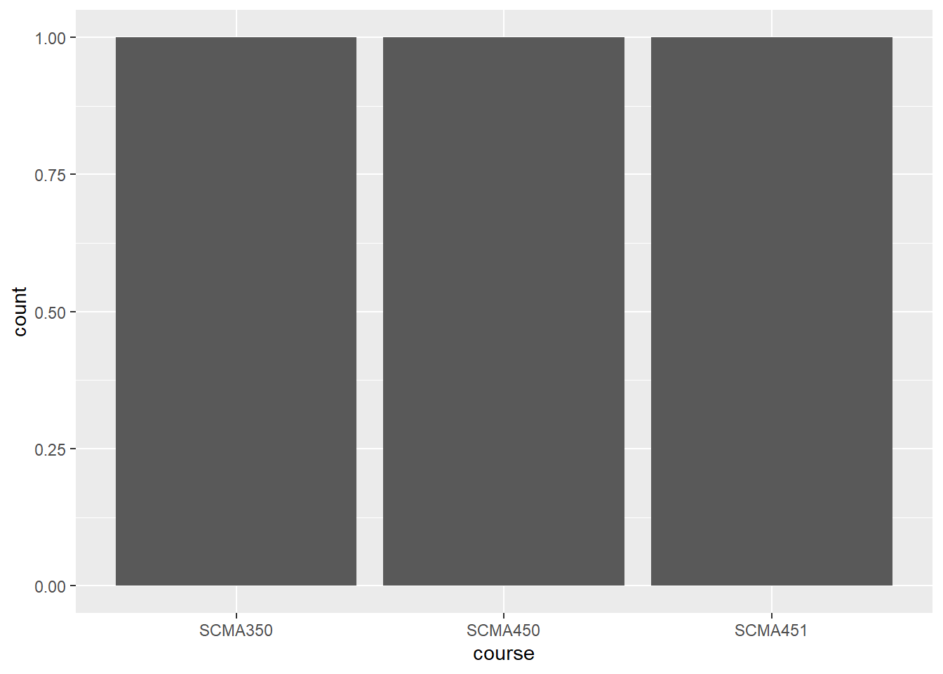
The y-axis is count; in other words, the code above counts the occurance of each course and plot that on the y-axis. To plot the evaluation data as it is, we need to set the y-axis as evaluation and set stat function as “identity”.
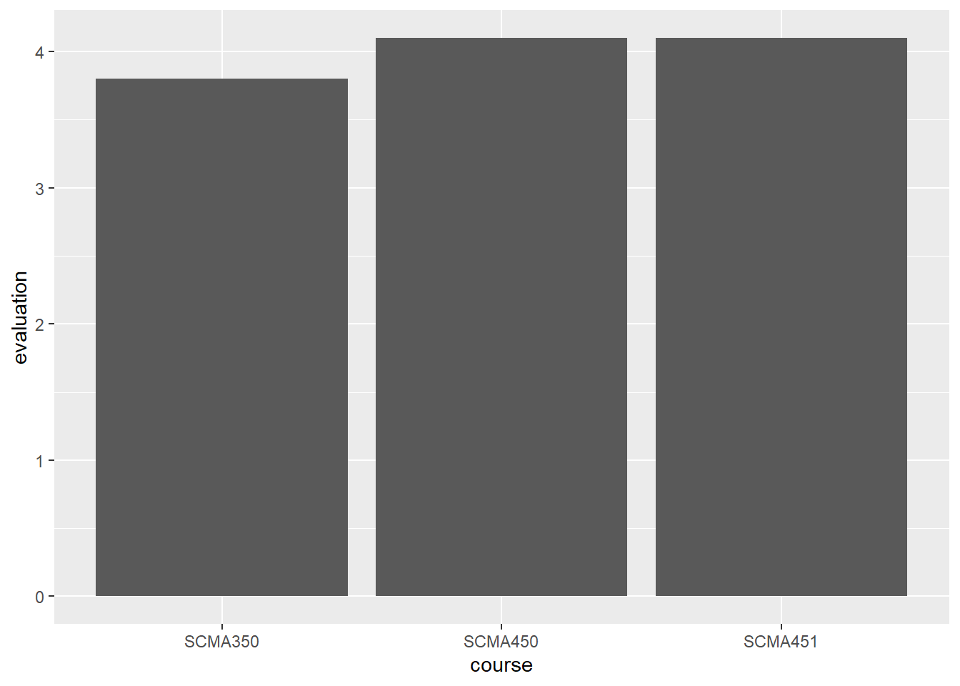
stat = “identity” tells the program to plot the data as it is, rather than generating the counts.
Now, plot a bar chart to show the average hwy for each manufacturer. In this case, we need to use the stat function for computing average.
# Plot a horizontal bar chart
ggplot(mpg, aes(x = manufacturer , y = hwy)) +
  # Add a bar summary stat of means, colored skyblue
stat_summary(fun = mean, geom = "bar", fill = "skyblue") 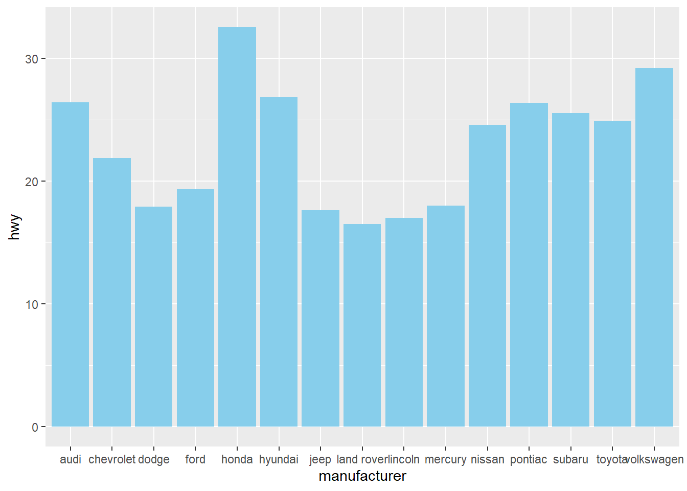
We can switch the x-axis and y-axis of a vertical bar chart so that the label for each manufacturer does not overlay each other.
# Plot a horizontal bar chart
ggplot(mpg, aes(x = manufacturer , y = hwy)) +
  # Add a bar summary stat of means, colored skyblue
  stat_summary(fun = mean, geom = "bar", fill = "skyblue", color="skyblue") +
  labs(x="manufacturer", y="highway miles per gallon")+ # add x/y labels
  coord_flip()
Or we can switch the x-y axis in the aes() mapping:
# Plot a horizontal bar chart
ggplot(mpg, aes(x = hwy, y = manufacturer)) +
  # Add a bar summary stat of means, colored skyblue
  stat_summary(fun = mean, geom = "bar", fill = "skyblue", color="skyblue") +
  labs(x="highway miles per gallon", y="manufacturer") # add x/y labels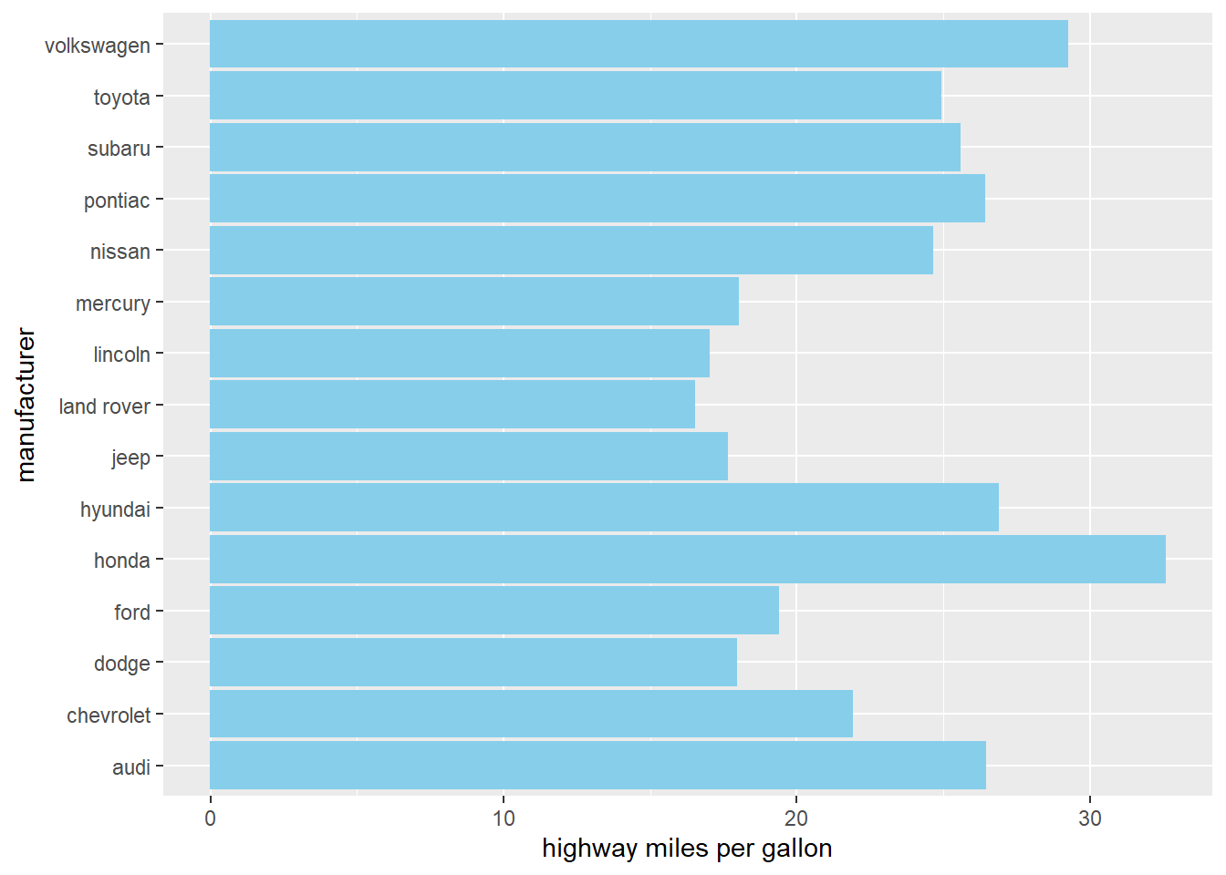
We can add more detail information to the chart by showing each points through geom_point()
# Plot a horizontal bar chart
ggplot(mpg, aes(x = manufacturer , y = hwy)) +

  # Add a bar summary stat of means, colored skyblue
  stat_summary(fun = mean, geom = "bar", fill = "skyblue", color="skyblue", alpha=0.3)+

  # add points to show the hwy of each Auto under the same manufacturer
  geom_point(position=position_jitter(width = 0.1), alpha=0.5)+

  labs(x="manufacturer", y="highway miles per gallon")+ # add x/y labels
  coord_flip()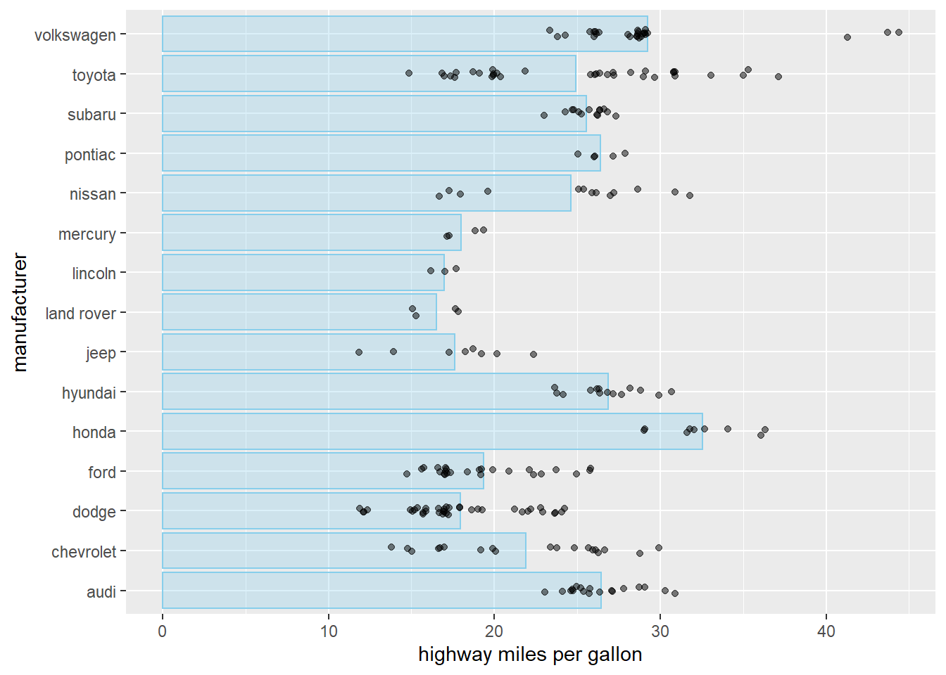
15.2 stacked par
In some cases, we want to show the composition of each bar. Stacked bar chart is for this purpose.
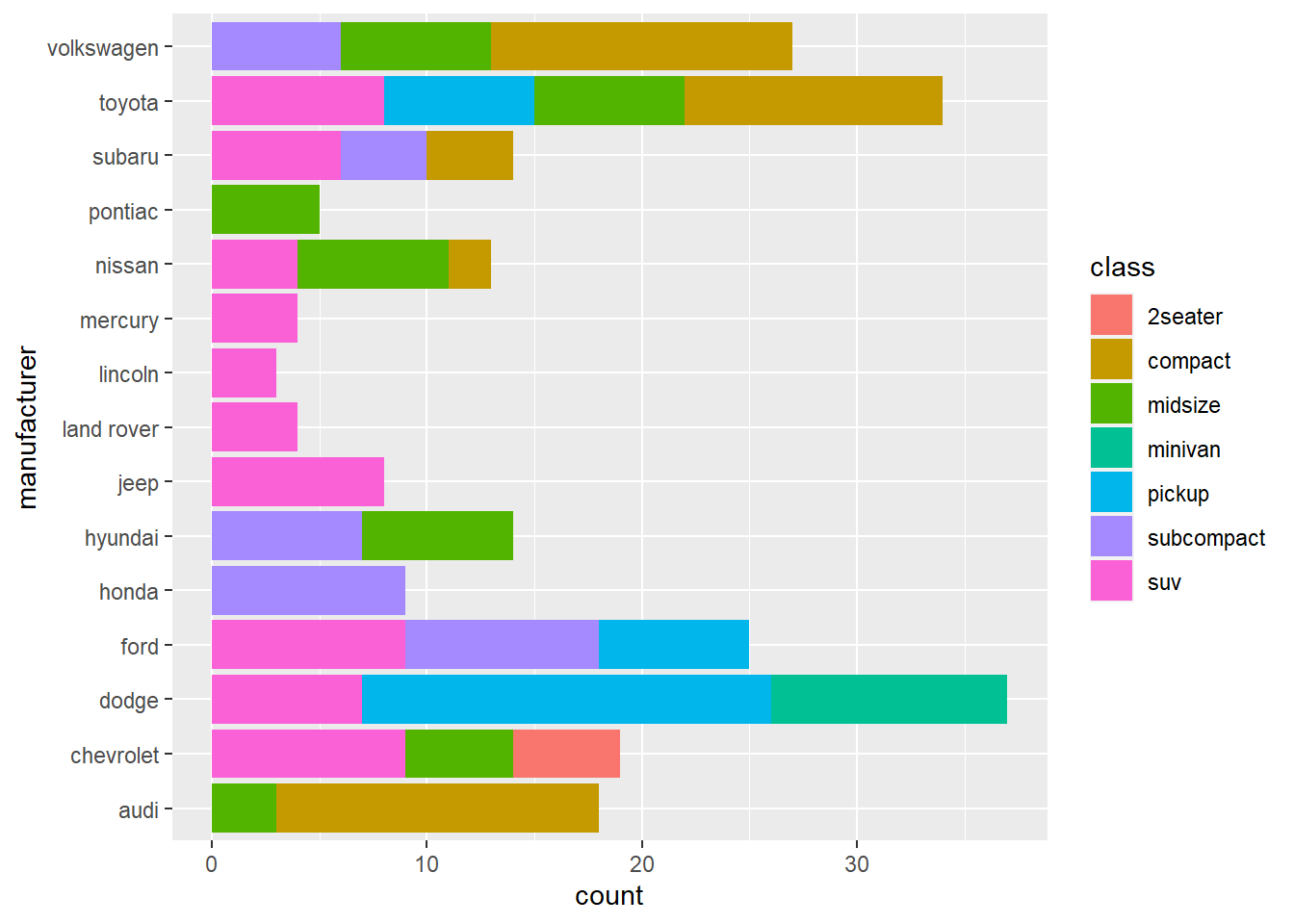
The above charts shows how many types of car each manufacturer has.
We can also stack bar side-by-side.
ggplot(mpg, aes(x =hwy, y = manufacturer, fill=class)) +
  stat_summary(fun = mean, geom = "bar", position = position_dodge2(width = 4, preserve = "single"))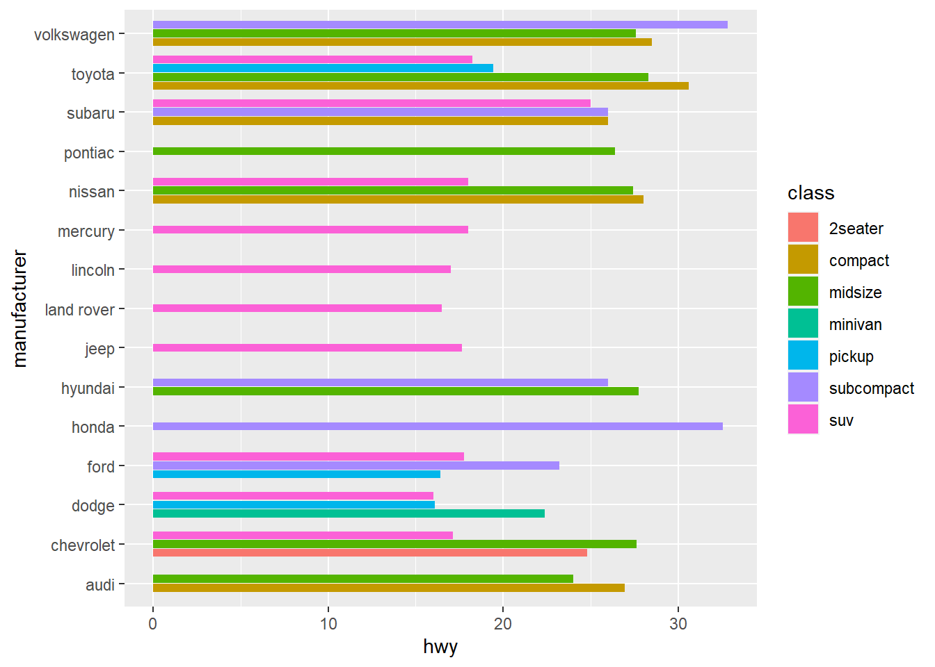
Again, we can facet the plot into subplot to show each sub-category.
ggplot(mpg, aes(x =hwy, y = manufacturer, fill=class))+
  stat_summary(fun = mean, geom = "bar")+
  facet_wrap(~class, nrow=7)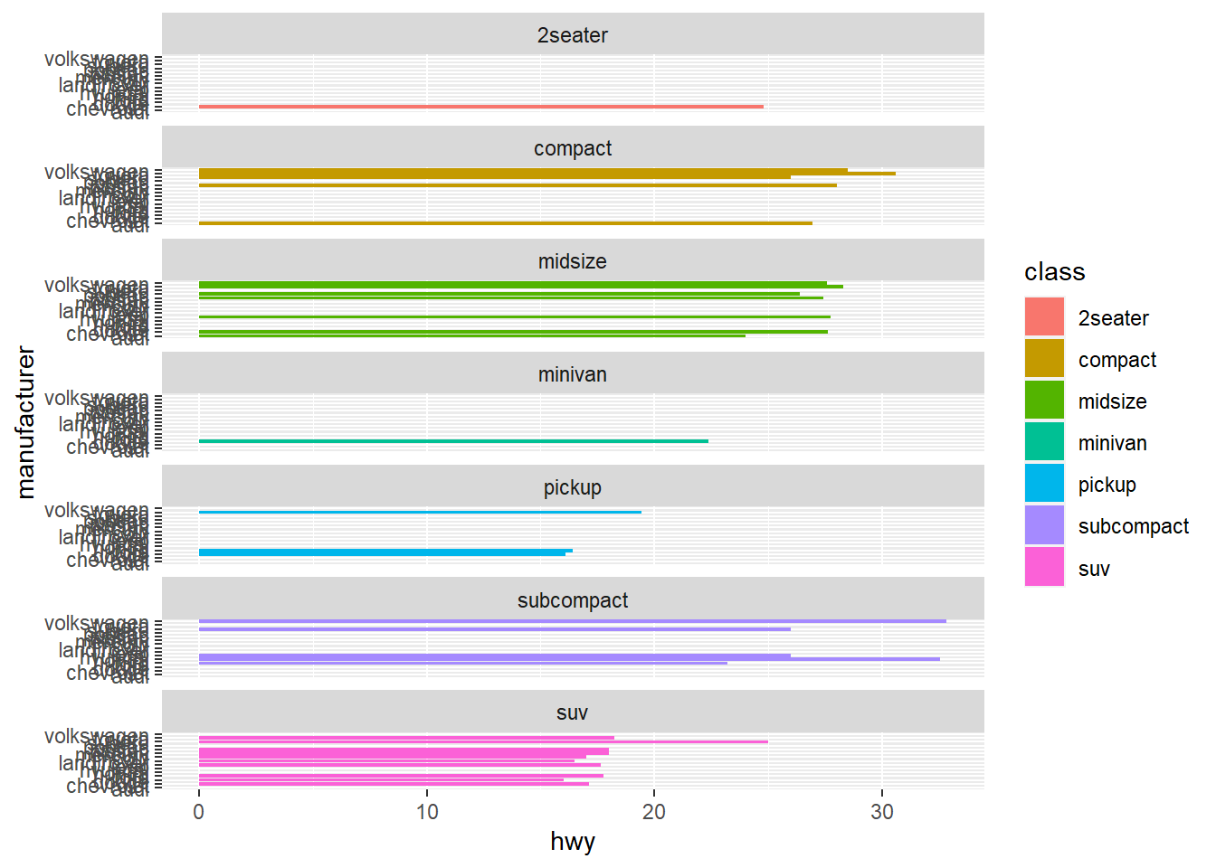
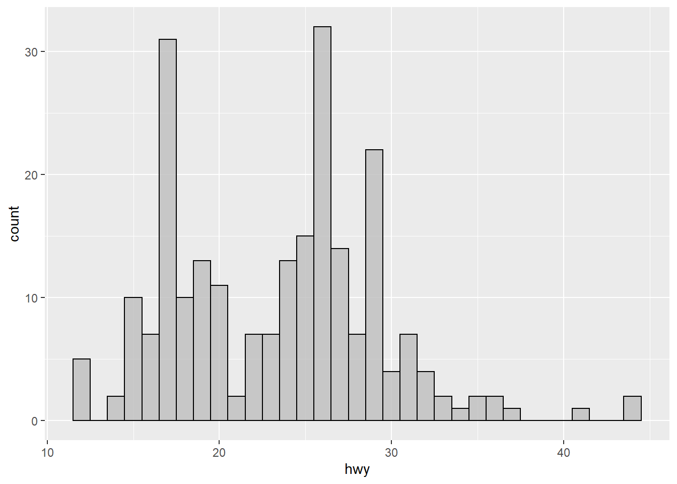
15.3 Histogram
Histogram is a great to see the distribution of a variable.
Histogram by group using facet_wrap() function
ggplot(mpg, mapping=aes(x=hwy)) +
  geom_histogram(binwidth=1, color="black", fill="gray")+
  facet_wrap(~ drv, nrow = 3) +
  coord_fixed(ratio=0.3)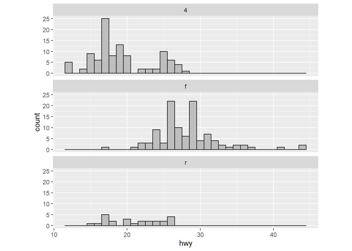
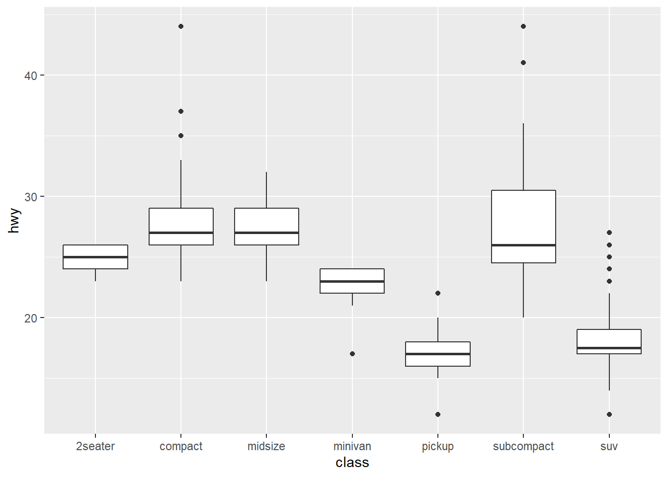
15.4 boxplot
Boxplot is a great way to show the median as well as its spread of a variable.
15.5 line chart
Line chart is usually used to show how a variable change over time. We will use the economics dataset which contains the US economic time series.
## # A tibble: 6 x 6
##   date         pce    pop psavert uempmed unemploy
##   <date>     <dbl>  <dbl>   <dbl>   <dbl>    <dbl>
## 1 1967-07-01  507. 198712    12.6     4.5     2944
## 2 1967-08-01  510. 198911    12.6     4.7     2945
## 3 1967-09-01  516. 199113    11.9     4.6     2958
## 4 1967-10-01  512. 199311    12.9     4.9     3143
## 5 1967-11-01  517. 199498    12.8     4.7     3066
## 6 1967-12-01  525. 199657    11.8     4.8     3018
Use a line chart to show how uempmed(unemployment rate) evolve over time:
ggplot(economics, aes(date, uempmed)) +
  geom_line(alpha = 0.7) +
  labs(x = "date", y = "unemployment rate")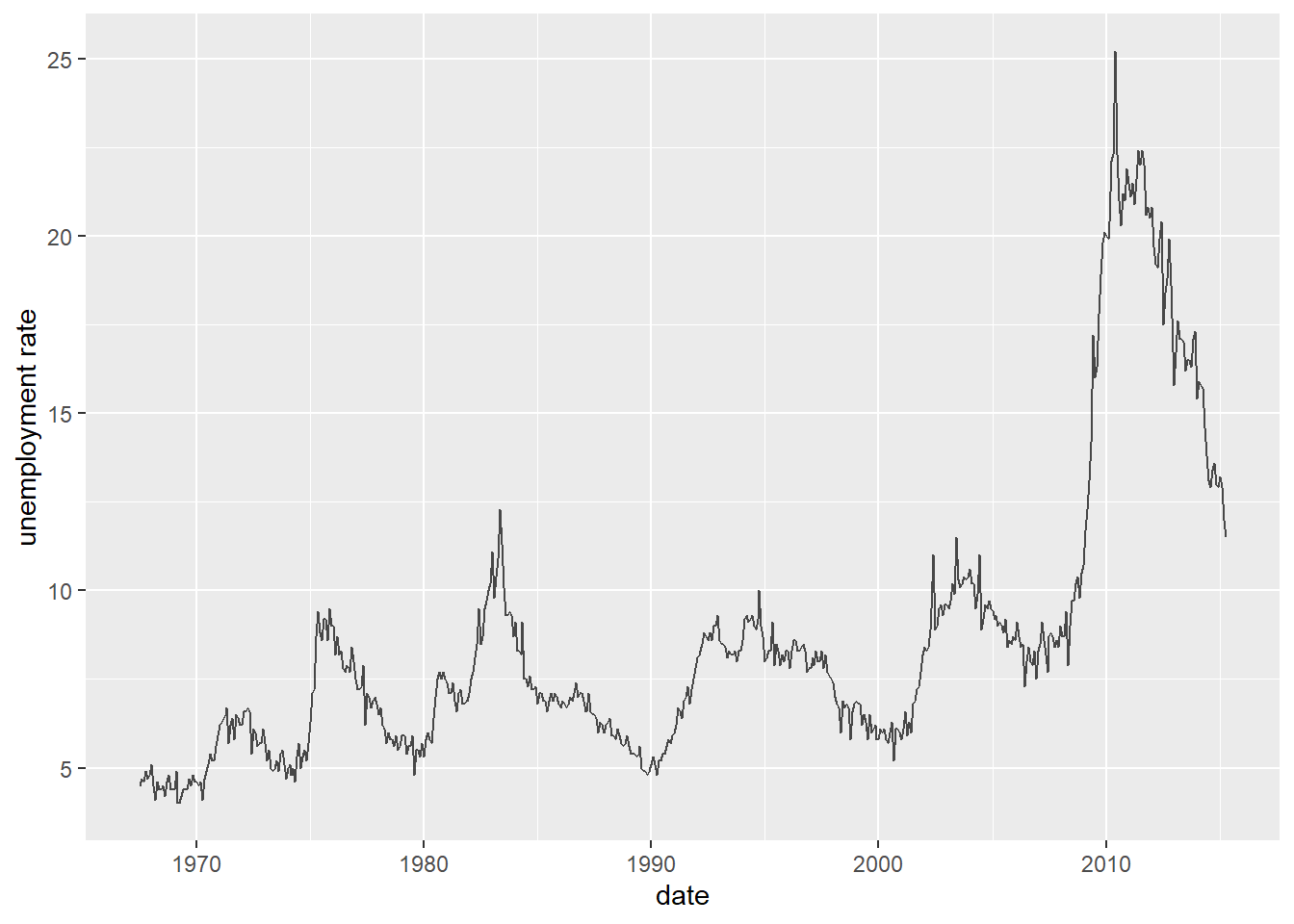
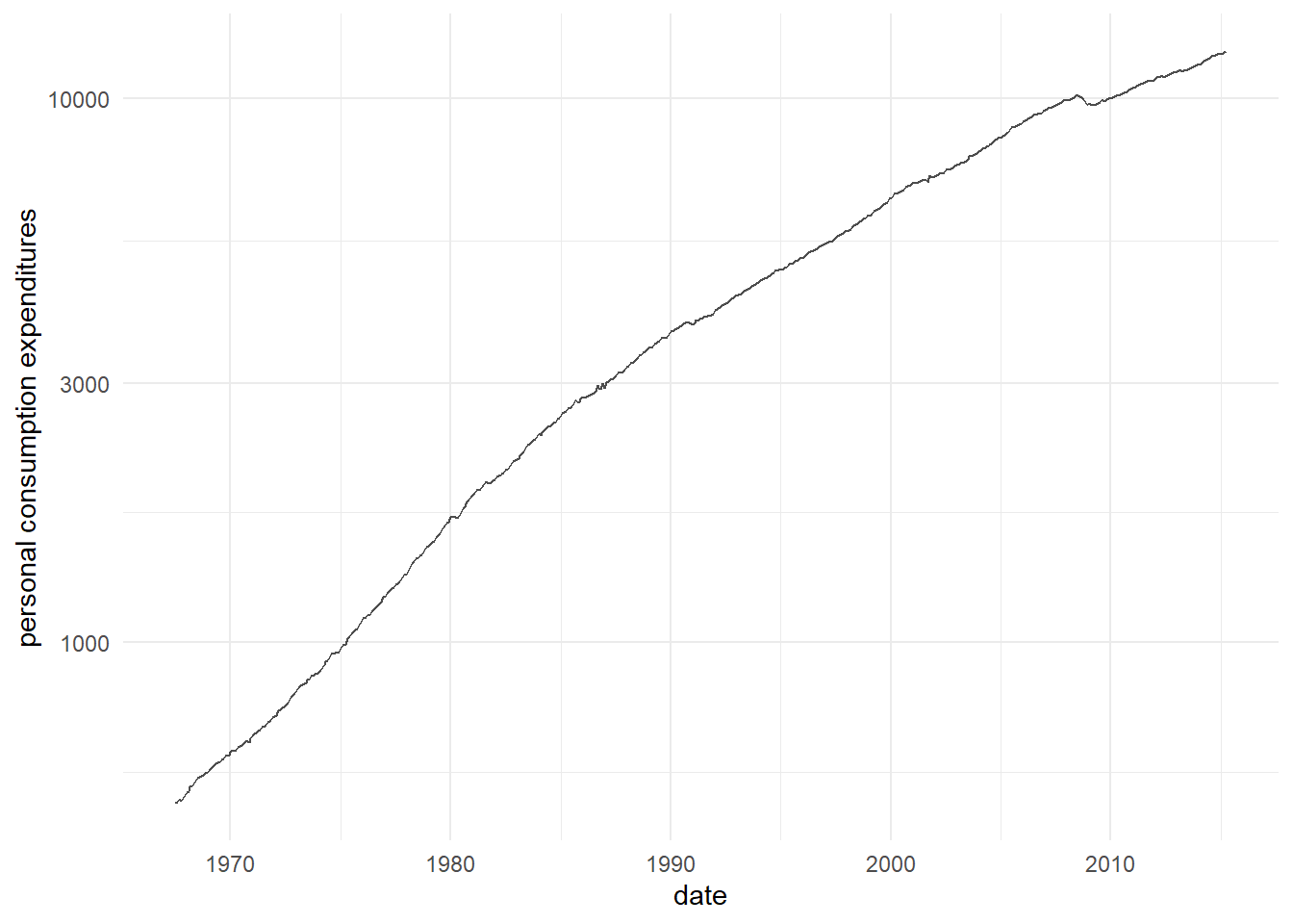
Use a line chart to show how pce(personal consumption expenditures, in billions $) evolve over time:
ggplot(economics, aes(date, pce)) +
  geom_line(alpha = 0.7) +
  labs(x = "date", y = "personal consumption expenditures")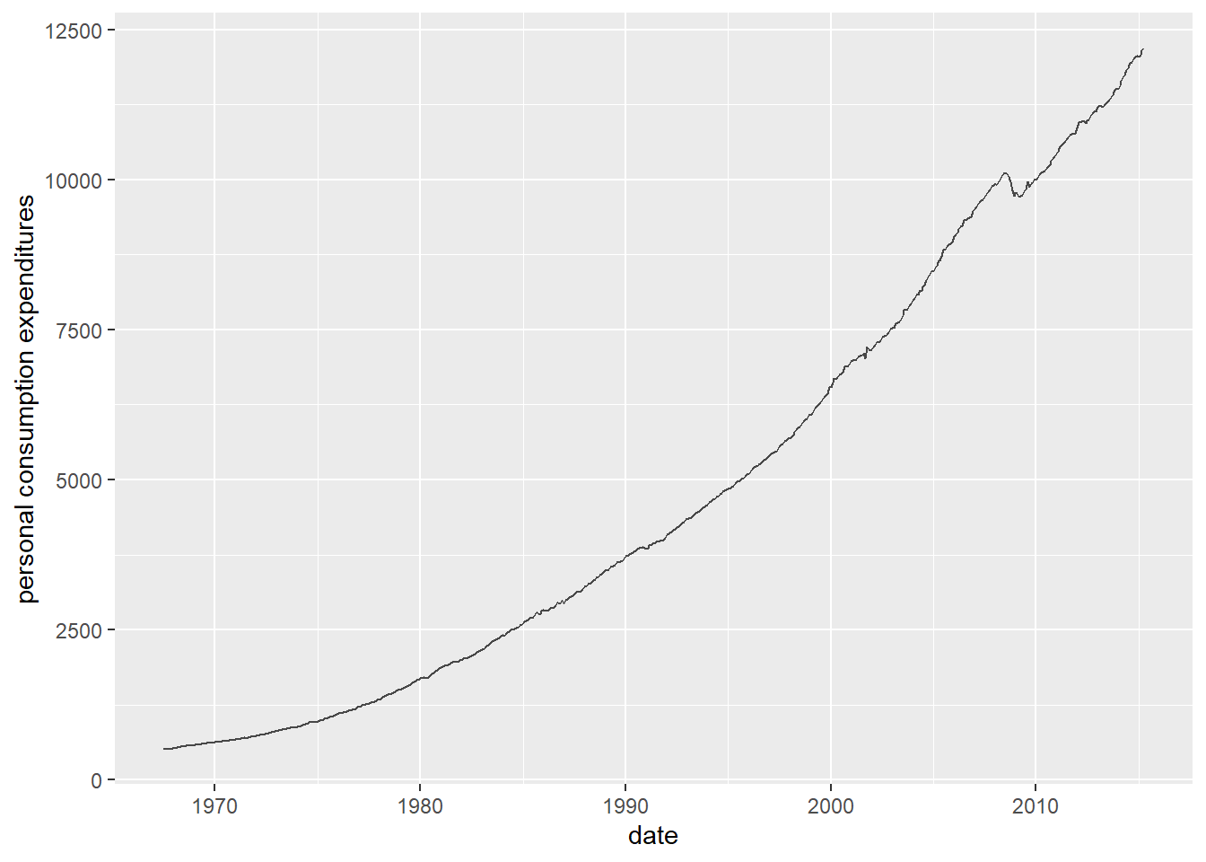
15.6 use theme to customize the appearance of your chart.
Many plot elements have multiple properties that can be set. For example, line elements in the plot such as axes and gridlines have a color, a thickness (size), and a line type (solid line, dashed, or dotted). To set the style of a line, you use element_line(). For example, to make the axis lines into red, dashed lines, you would use the following.
g=ggplot(economics, aes(date, pce)) +
  geom_line(alpha = 0.7) +
  labs(x = "date", y = "personal consumption expenditures")

g + theme(axis.line = element_line(color = "red", linetype = "solid"))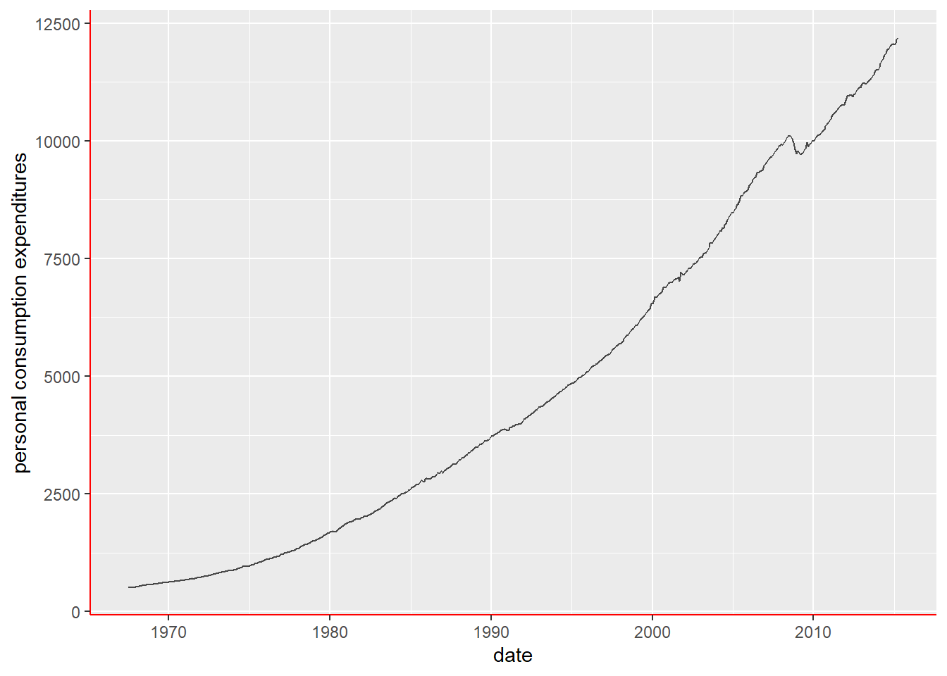
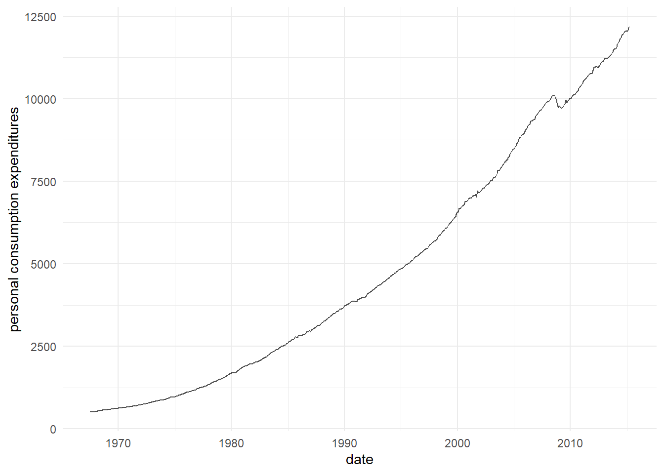
Built-in themes: In addition to making your own themes, there are several out-of-the-box solutions that may save you lots of time.
theme_gray() is the default.
theme_bw() is useful when you use transparency.
theme_classic() is more traditional.
theme_void() removes everything but the data.
The g+theme_minimal() is the my go-to-theme.
When the x/y axis goes too high, we may want to compress the axis through log-transformation.
15.7 Summary
- we show how to make other types of charts, including, bar, boxplot.